
Type of applicant company
品牌方
Country
中国
Company Website
https://www.zhouheiya.cn/
Images
Brand of the Product
zhouheiya
Designer Name
Yanyi
Position of Designer
无
Target Consumer
Young urban white-collar workers, urban family consumers, Gen Z young students, and new entrants to the workplace
Distribution Channels
电商 E-commerce; 其他销售渠道 品牌连锁店
Positioning
大货消费品 Mass Production
Design Story
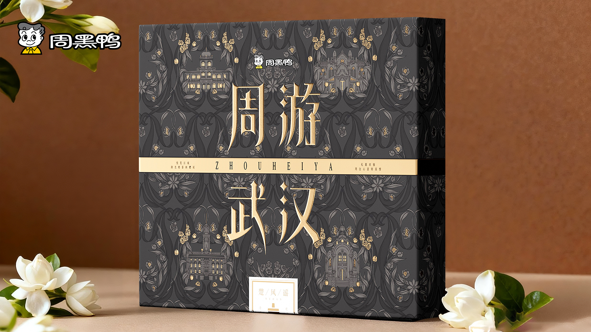
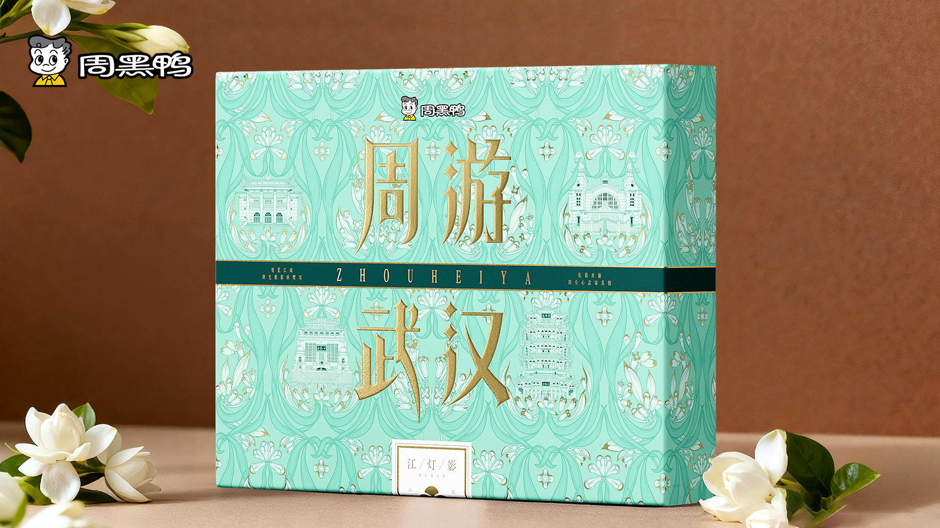
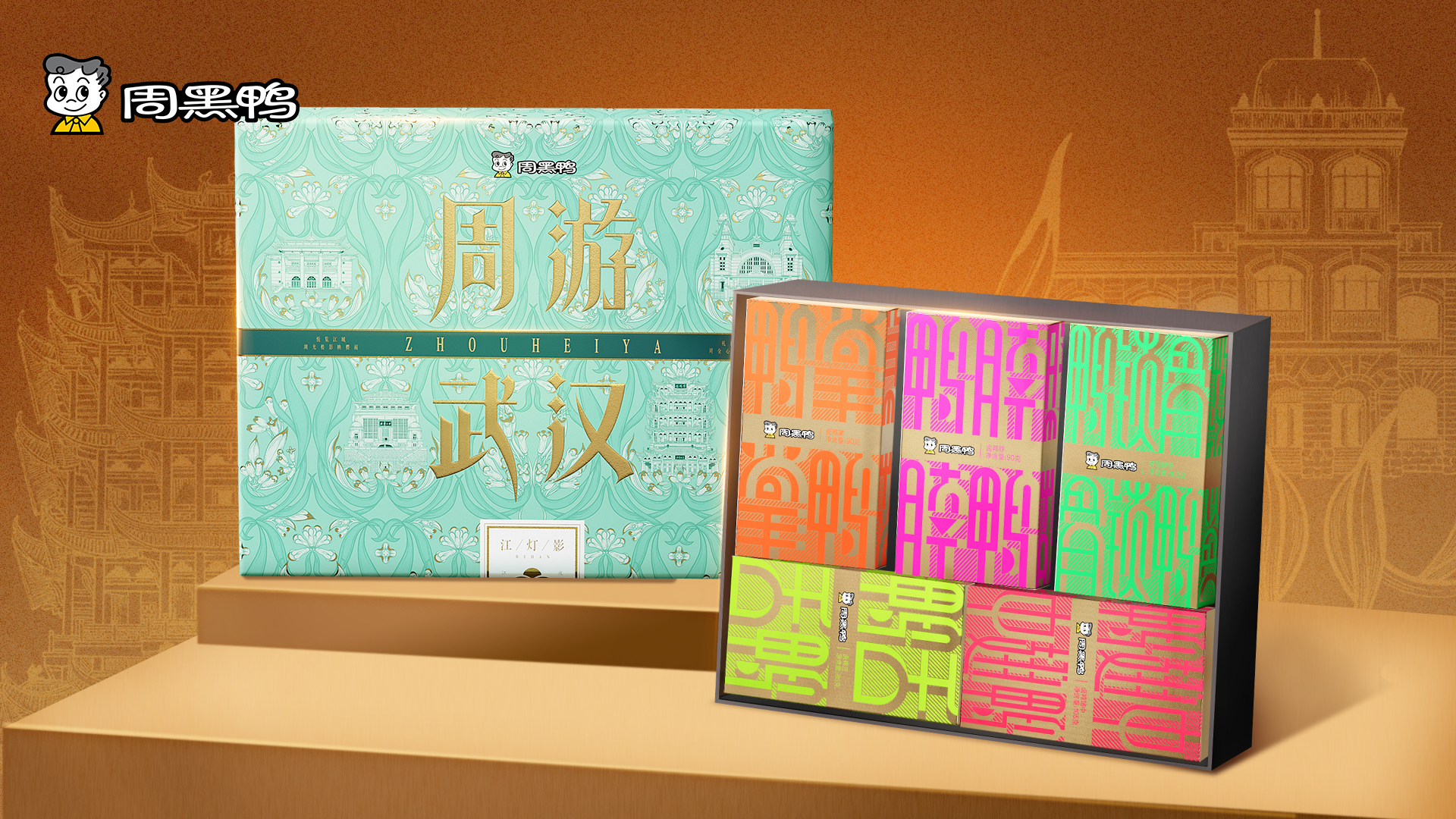
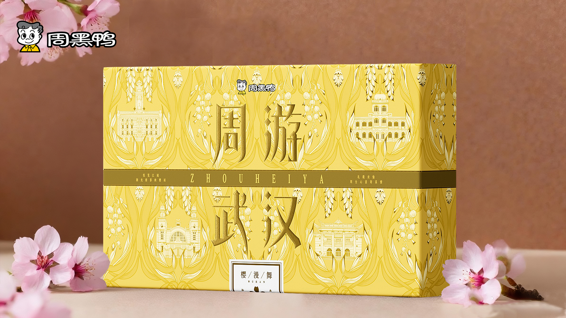
This work was born under the background of Zhouhei duck's promotion from "Wuhan Taste Card" to "City Culture Gift". The design aims to go beyond its food attributes and become a container that carries Wuhan culture, travel memories, and gift emotions.
The design is based on the core concept of 'traveling around Wuhan'. The word "Zhou" is a pun that not only embeds the brand name, but also implies "thoughtful consideration" and "dynamic travel". 'Travel' highlights the travel and exploration attributes of souvenirs. Through the triple integration of brand, city and emotion, Zhouhei duck has leapt from "delicious braised duck" to "must take Wuhan mind", completing the identity transformation from specialty to cultural symbol.
Highlights
With the "visual symphony of spices and urban buildings" as the source of creative expression, the Zhouhei duck stewed spices (such as pepper and anise) are deconstructed into continuous patterns, and Wuhan landmark buildings are embedded in them, creating a unique synaesthesia of taste and vision, and realizing the transition from "specialty" to "cultural symbol".
Compared with ordinary souvenirs, this work provides profound emotional and narrative value by deeply translating urban culture and brand genes. It's not just a commodity,. It is not only a commodity, but also a "city souvenir" that brings a deep sense of cultural belonging and emotional connection to consumers and recipients.
Market Performance
None (sales less than two months)
Material(For concept works, please choose the material you plan to use)
其他 白卡盒
Craft
Hot stamping,UV
Does the design solve the problems that are common across the product category? If so, please explain.
Not simply stacking city symbols, but creatively integrating spice patterns with architecture to form a unique visual narrative system, endowing packaging with readable cultural depth, avoiding the problems of design homogenization and lack of depth; Starting from the core of the brand (spices) and the soul of the city (architecture), let taste elements become the visual foundation, and urban elements naturally embellish it, so that the brand and urban culture can be organically integrated and mutually empowered, rather than simply pieced together, avoiding the problem of a rigid combination of the brand and regional culture.
What functional designs of the work have enhanced the user experience?
The packaging visual composition creates a miniature city map that can be "roamed", where consumers can search and identify well-known landmarks and niche check-in points embedded along the texture of spices. A natural and soft blank area is formed between the main visual pattern and the basic unit pattern, which is used to clearly display the brand logo and product information, ensuring effective communication of core information and enhancing the overall sense of luxury and reading comfort. The main color scheme and architectural elements processed into black and white lines complement each other, focusing consumers' visual attention on urban architectural elements and strengthening the core concept of the "urban gift box", creating an elegant and retro aesthetic experience
Does the work consider sustainability (environmentally or commercially, or both)? If so, please explain.
By injecting profound cultural value, the product has been successfully upgraded from a fast-moving food item to a high-value commemorative gift, greatly enhancing its profit margin and brand image. As a souvenir for the city, it can effectively attract tourists and become a part of promoting the city's image