
Type of applicant company
设计机构
Country
中国
Company Website
elmwood.com
Images
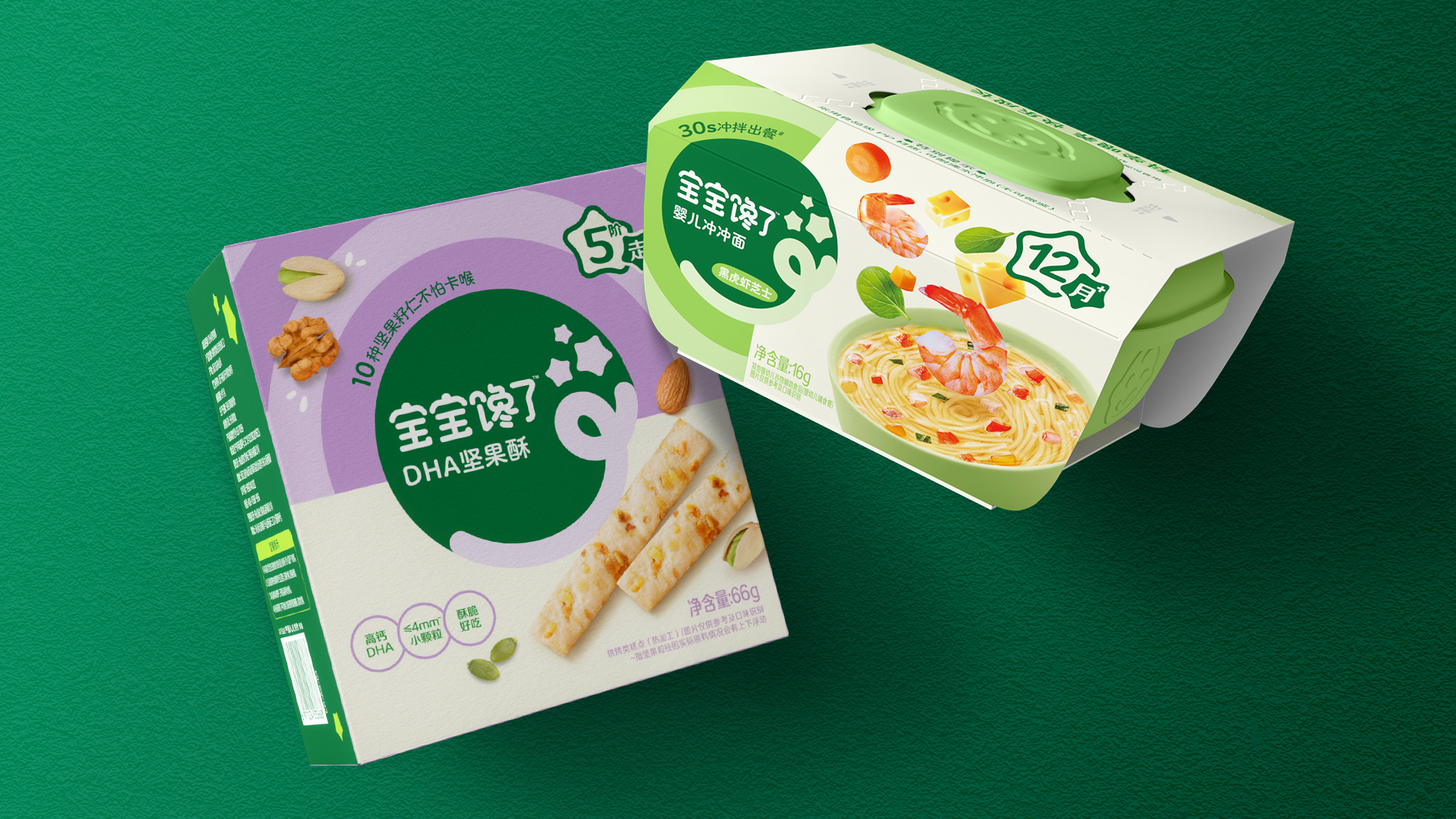
Brand of the Product
Baobaochanle
Designer Name
Violet Tan (ACD), Tang Lily (Design Director) , TaoTao (Designer), Shawn Xi (Designer)
Position of Designer
none
Target Consumer
Pioneering mothers of infants and toddlers aged 0–6.
Distribution Channels
电商 E-commerce; 小型商超和便利店 Supermarket & CVS; 其他销售渠道 母婴店 baby store
Positioning
大货消费品 Mass Production
Design Story
In China’s fast-growing baby food market, BBCL faced the challenge of maintaining leadership in a category crowded with new players and look-alike packaging. The brand needed a sharper positioning and a more premium image to resonate with modern parents seeking both trust and emotional warmth.
Our task was to renovate the entire brand identity — from the master logo to the packaging system across five sub-categories, and build a unified yet flexible brand world that strengthens recognition and relevance across all channels.
Strategic Insight
Parents today are driven by dual desires: scientific nutrition and joyful discovery. BBCL’s existing visual system over-indexed on function but lacked emotional connection. Our insight was to express “delicious nutrition crafted for little explorers”, transforming BBCL from a rational baby food brand into an inspiring companion in every child’s growth journey.
Creative Idea
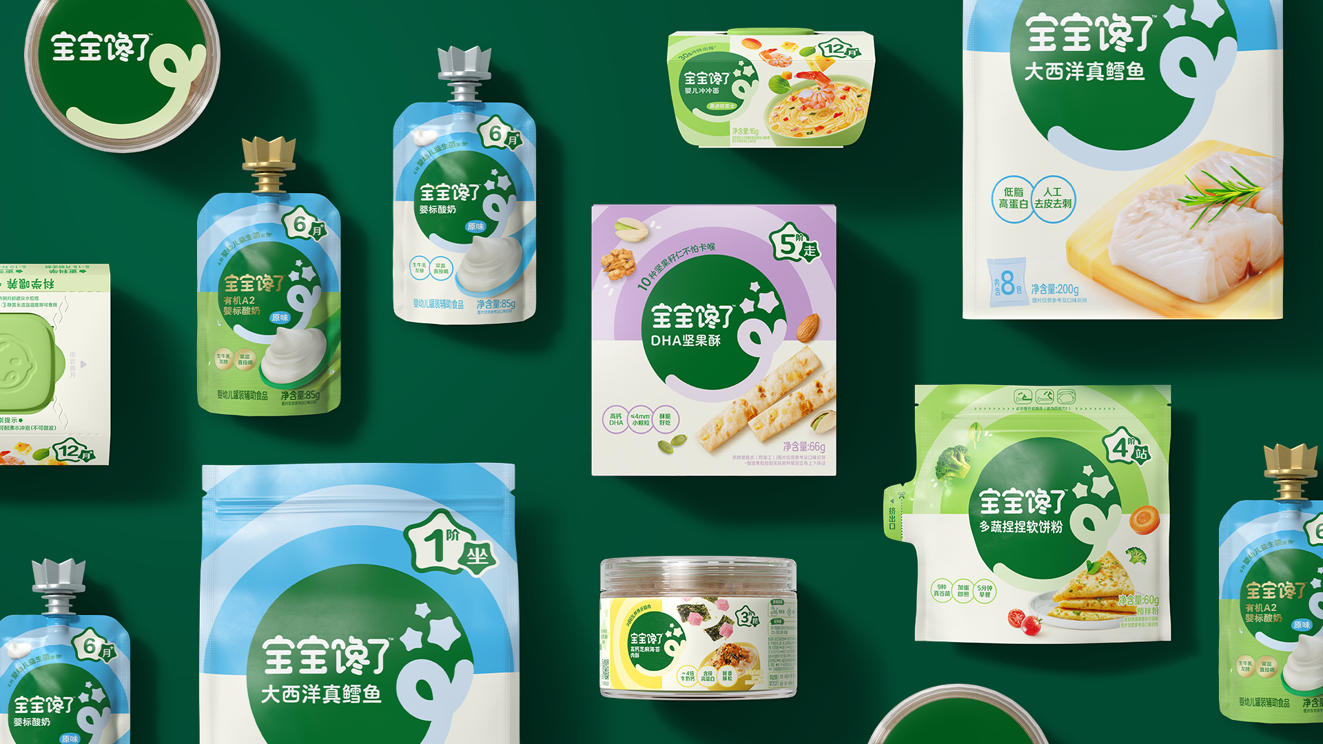
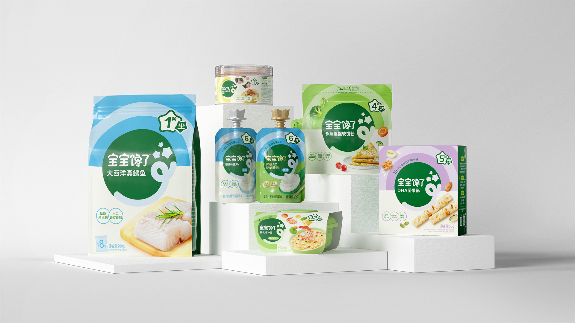
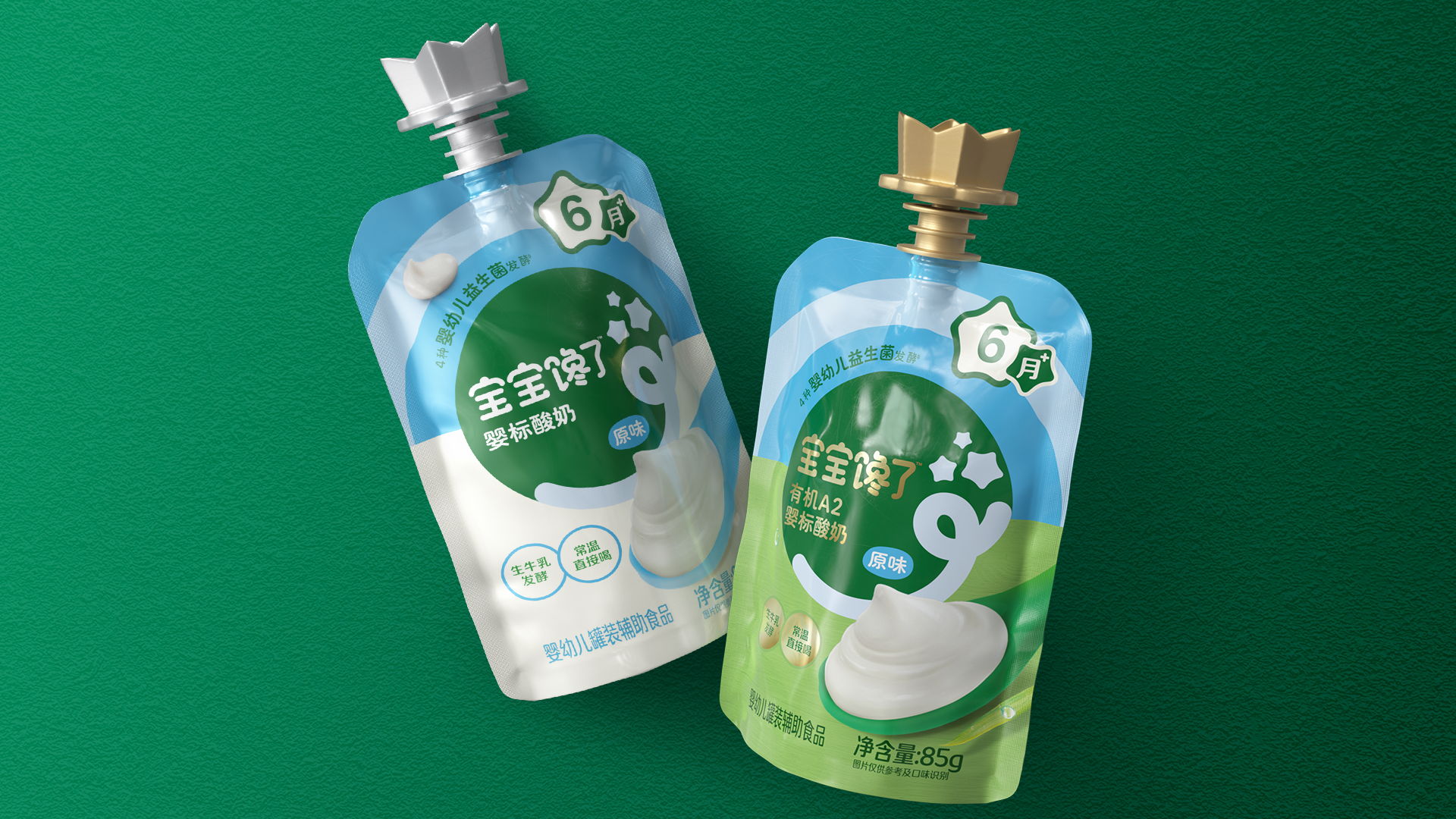
The creative foundation was built on “dynamic warmth”, balancing scientific trust with sensory appetite. The new brandmark retains recognizability but gains modern precision. A vibrant yet natural color palette differentiates age segments and product types, while a clean typographic hierarchy ensures clarity on pack and compliance with regulatory detail. Custom illustrations and textures bring storytelling and freshness to life, turning every pack into a moment of delight.
Holistic Brand World
Beyond packaging, we extended the visual language across 360° touchpoints: brand VI, e-commerce, social content, and in-store displays, ensuring a coherent and immersive experience. Every element, from photography style to iconography, reflects BBCL’s belief that “good food nurtures both body and imagination.”
Design Impact
The new design system elevated BBCL’s shelf presence and digital impact, achieving clearer portfolio navigation and stronger differentiation within the category. Parents perceive the new BBCL as more credible, caring, and premium, driving greater trust and purchase intent both online and offline.
Client feedback speaks volumes:
“Our business spans multiple categories and age segments, making consistency a real challenge. Elmwood’s approach transformed complexity into clarity. Their design thinking and execution were truly inspiring.”
— Chensheng, CEO of BBCL
Result
Through the BBCL brand transformation, design became a bridge between strategy and emotion. The new visual identity not only unified a complex system but re-energized the brand with warmth, imagination, and modern credibility — creating a living brand world that continues to grow with every family it touches.
Highlights
What makes the BBCL brand transformation stand out is its ability to turn complexity into clarity, creating a unified brand world that feels both scientifically credible and emotionally irresistible.
In the baby food category, visual chaos is common — fragmented identities, mixed claims, and inconsistent systems across age ranges. BBCL was no exception. Its previous design lacked hierarchy and warmth, making it difficult for parents to navigate or trust the brand.
Our breakthrough was to design not just packaging, but an entire ecosystem of visual communication — a living system that connects the master brand, sub-lines, and every consumer touchpoint through one cohesive visual logic.
1. System Thinking with Soul
We built a modular design framework that unifies five major sub-categories while preserving flexibility for growth. This system is not a rigid template, but a living structure guided by clear principles — consistent brandmark application, disciplined typography, and a calibrated color logic linked to age and nutrition stages.
What makes it remarkable is how emotion is embedded in structure: each element — illustration, photography, and iconography — follows one brand grammar, expressing both nutritional science and playful imagination.
2. Visual Storytelling that Connects Head and Heart
Each pack tells a story of “delicious nutrition crafted for little explorers.”
Through handcrafted illustrations and tactile textures, the design brings to life the joy of a child’s curiosity and appetite for discovery. These details are not just decorative — they convey care, freshness, and quality, translating functional benefits into emotional value.
The result is a packaging system that parents feel before they even read — clean, trustworthy, and full of warmth.
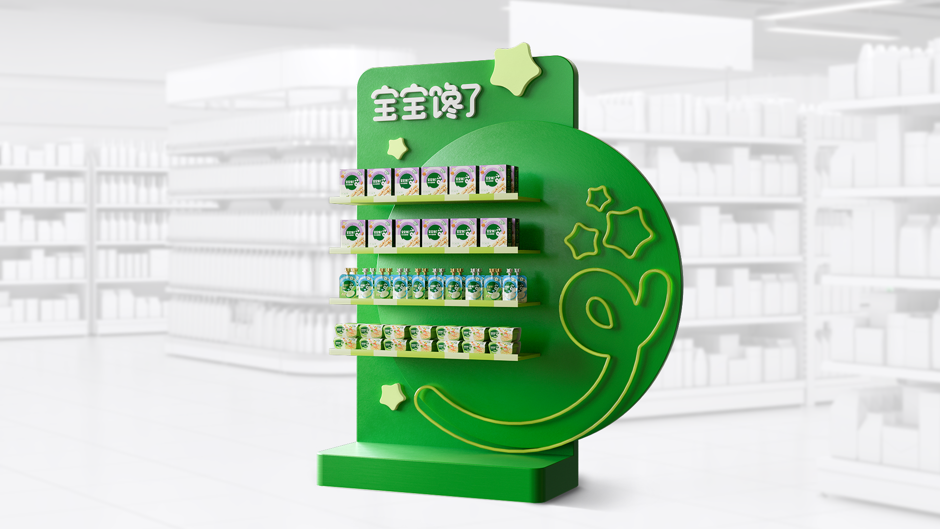
3. 360° Brand World Execution
The most impressive part is how the design extends seamlessly beyond pack. The brand identity was activated across e-commerce, social media, retail displays, and even souvenirs, creating a truly immersive 360° ecosystem. Every expression — from photography tone to icon style — reinforces the same narrative and strengthens recognition.
This coherence transforms BBCL from a product brand into a cultural symbol of care and nourishment.
4. Design Impact
The new identity redefined BBCL’s category presence — achieving stronger shelf visibility, clearer portfolio navigation, and elevated perception among modern parents. Internally, it provided a blueprint for future innovation and design governance across teams and agencies.
As one client described:
“Elmwood’s work didn’t just make our packaging beautiful — it made our brand understandable, lovable, and scalable.”
In short, the most impressive achievement of the BBCL redesign lies in turning a multi-layered system into an emotionally resonant brand world — where design thinking, storytelling, and commercial impact come beautifully together.
Market Performance
1. Sales Growth:
From April to June 2025, sales increased by approximately 25.6% compared to the January–March 2025 period.
2. Market Share Expansion:
Market share rose from 9.0% in Q1 2025 to 10.4% in Q2 2025, showing significant category growth.
3. Improved Repurchase Rate:
Consumer repurchase frequency also increased notably:
- 30-day repurchase rate: up from 22.1% to 24.4%
- 60-day repurchase rate: up from 33.8% to 36.7%
Material(For concept works, please choose the material you plan to use)
PET塑料 PET material; 纸质 Paper
Craft
Given that this product is intended for infants and young children, the materials selected are in compliance with national food safety standards for infants and young children.
Does the design solve the problems that are common across the product category? If so, please explain.
- problem & solution 1:Compared with brand building, most local brands tend to focus more on their products, resulting in serious homogenization. In this brand revamp, we first simplified the existing brand asset — the “Yummy” graphic — to enhance its recognizability, distinctiveness, and youthful appeal, positioning it as the core brand asset. At the same time, we introduced circular supporting graphics — colorful, flat circles that visually convey both a sense of science and joy. In communication materials, these circles also help highlight the main visual elements.
- problem & solution 2: Due to the nature of the mother and baby category, packaging fronts often need to present multiple selling points, which can easily lead to cluttered and hard-to-read layouts. In this brand visual upgrade project, we analyzed and organized over 300 pieces of packaging information across 6 product categories to develop a clear and easily extendable packaging visual architecture system. This system significantly optimized the information hierarchy, ensuring that while maintaining visual appeal, consumers can more intuitively and clearly understand the product’s key benefits.
What functional designs of the work have enhanced the user experience?
To help mothers quickly identify the right product for their baby’s age among many options, we created a unique age-stage icon system for the brand, placed at the top right corner of the packaging. Each age stage is also paired with a distinct background color, further enhancing the shopping experience by making product selection clearer and more intuitive for mothers.
Did the design help increase the sales performance of the product? If so, please give related evidence.
1. Sales Growth:
From April to June 2025, sales increased by approximately 25.6% compared to the January–March 2025 period.
2. Market Share Expansion:
Market share rose from 9.0% in Q1 2025 to 10.4% in Q2 2025, showing significant category growth.
3. Improved Repurchase Rate:
Consumer repurchase frequency also increased notably:
- 30-day repurchase rate: up from 22.1% to 24.4%
- 60-day repurchase rate: up from 33.8% to 36.7%
Does the work consider sustainability (environmentally or commercially, or both)? If so, please explain.
none