
Type of applicant company
设计机构
Country
英国(总部),中国,美国
Company Website
https://jdoglobal.com/
Images
Brand of the Product
Jameson
Designer Name
Paul Drake, Founder, JDO; Ben Ridley, Creative Director; Sam Leventhal, Client Partner; Phil Marlow, 3D & Technical Director; Peter Aldous, Production Manager; Frank James, Design Director; Dan Bowstead, Design Director; Cody Hoerauf, Senior Designer; Jay Dorward, Senior Designer; Leon Paoli-Burke, Junior Designer; Katie Rotherham, Senior Client Manager; Janice Jung, Client Manager; Annabel Niania, Client Director; Chloe Platt, Senior Artworker; Damian Hughes, Creative CGI & Motion Director; Kayvon Palangafkan, Senior Visualiser; Petter Ögren, Senior Image and Motion Visualiser
Position of Designer
None
Target Consumer
Jameson speaks to a broad and global audience, from established whiskey drinkers and collectors to new recruits entering the category.
Distribution Channels
小型商超和便利店 Supermarket & CVS; 杂货店 Grocery; 餐饮&酒店 Restaurants & Hotel
Positioning
大货消费品 Mass Production
Design Story
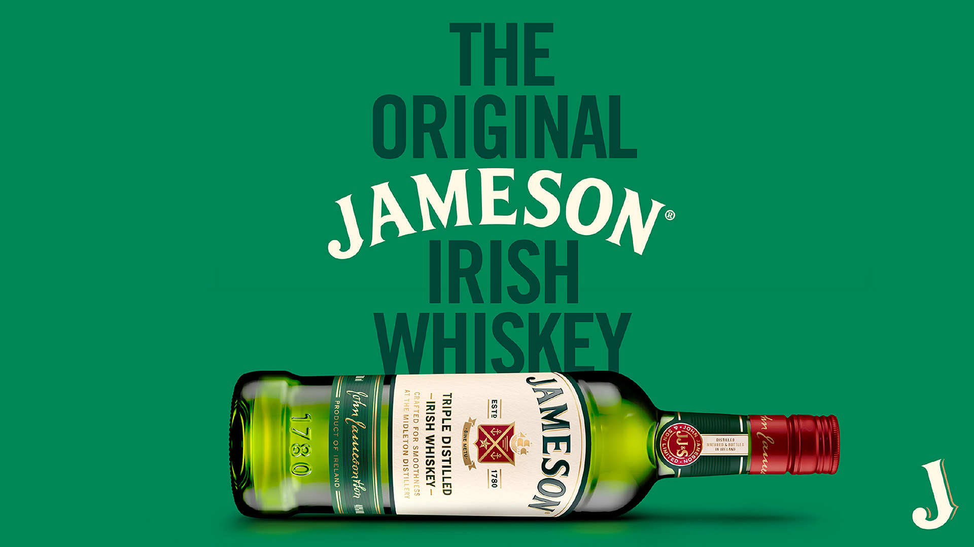
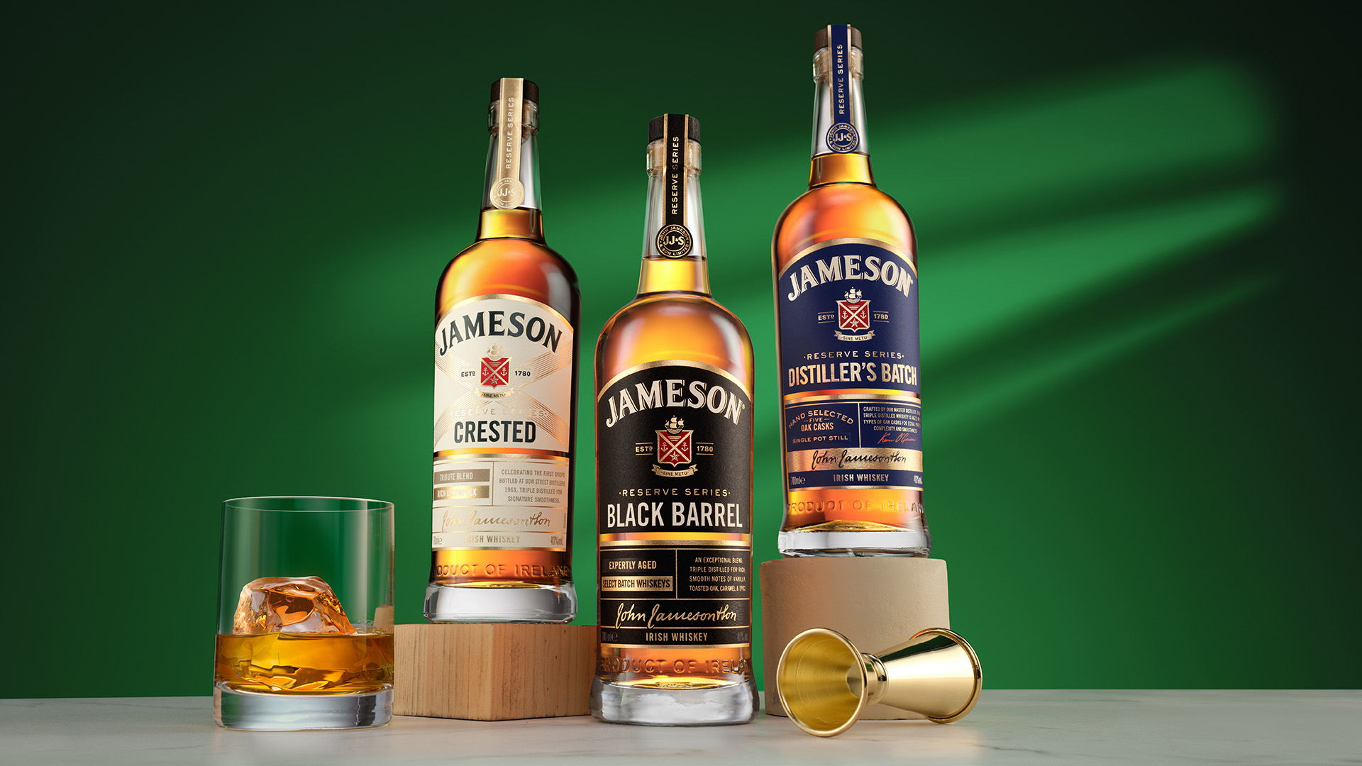
Founded in 1780, Jameson is the world’s best-selling Irish whiskey, with a legacy built over centuries. Its green bottle, arched wordmark, and iconic crest are instantly recognisable around the globe, forming a visual language rich with heritage and familiarity. But with longevity comes the pressure to remain relevant. As the category evolved and competition intensified, Jameson recognised the need to strengthen how the brand showed up in the world, without losing what people already loved.
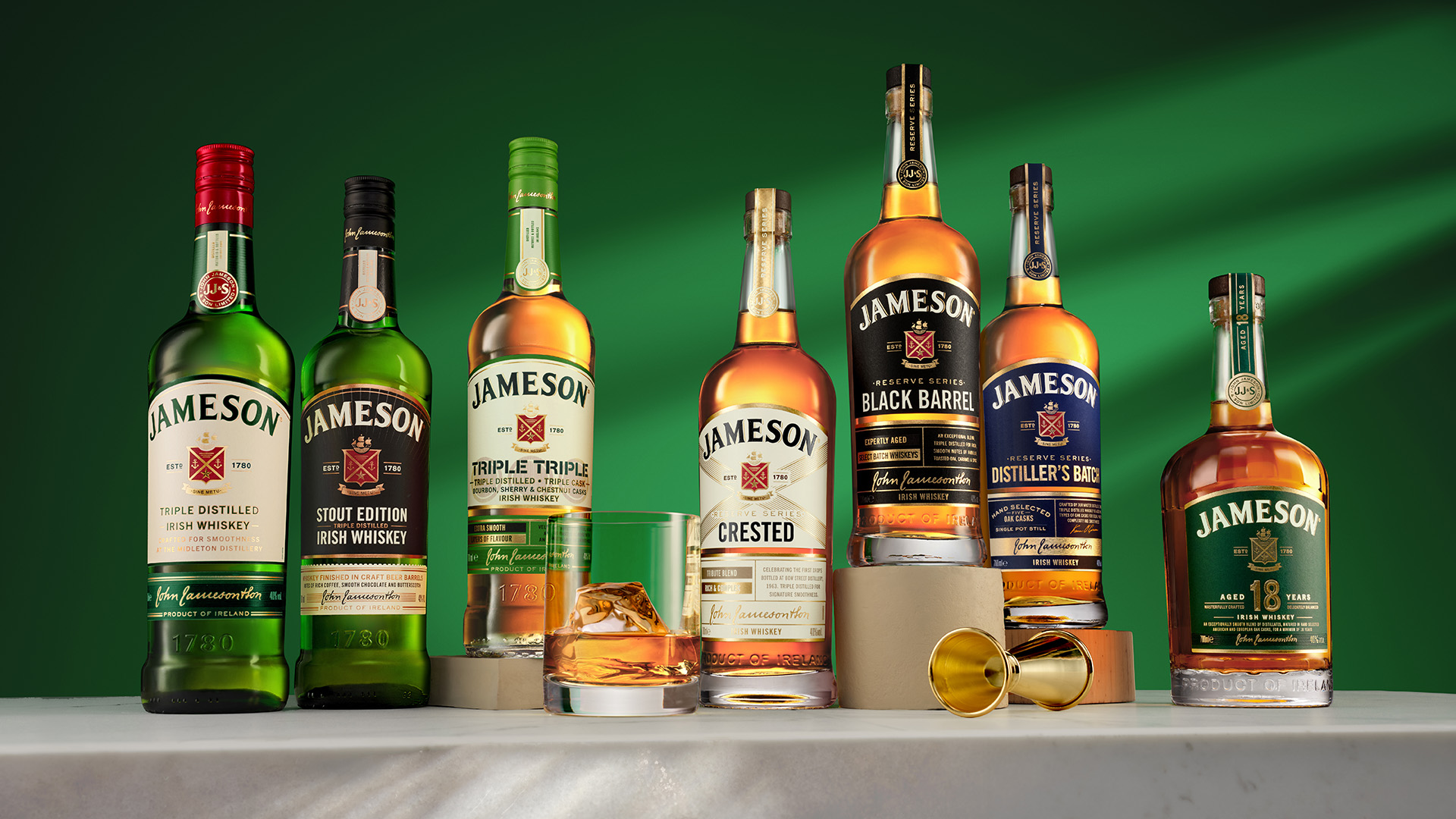
Jameson partnered with independent brand and design agency JDO to evolve its identity and packaging system. The task was not to reinvent the brand, but to refine it. This time, the scope extended beyond the flagship Original to encompass the full portfolio. The objective was to create visual harmony across the range, subtly modernise the Original, and give consumers clearer cues to understand, explore, and trade up within the Jameson family.
Extensive conversations with whiskey drinkers, bartenders, and retailers across global markets revealed a clear opportunity. While Jameson was deeply loved, the portfolio could do more to express distinction, tell the story behind each whiskey, and stand out more clearly on shelf. The challenge lay in balancing two forces. On one side, Jameson’s deep heritage and brand equity demanded restraint and respect. On the other, the brand’s irreverent spirit as “the serious whiskey that does not take itself too seriously” called for warmth, wit, and approachability.
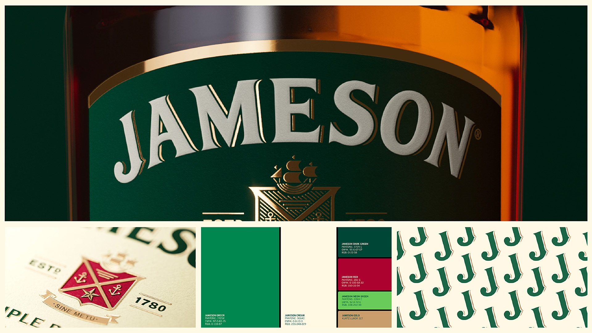
JDO’s creative strategy focused on sharpening what already existed. Iconic elements such as the arched logo, the crest, and the seal were carefully refined rather than replaced. The crest was re-sculpted to stand taller and prouder on pack. The wordmark gained height and presence through refined typography, with subtle adjustments to serifs, shadows, and letterforms that compound into a stronger overall impression.
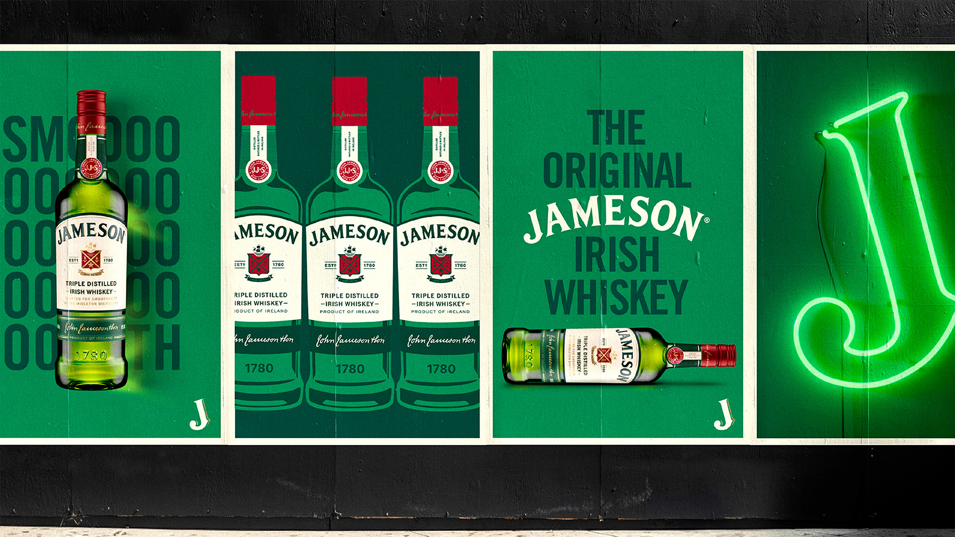
A brighter, more confident colour palette and the introduction of illustrated bottle artwork added flexibility and character, allowing the brand to feel more expressive without losing authority. Alongside this, JDO developed a shared system of visual codes that unites the Jameson family while giving each expression space to express its own craft, story, and personality.
The result is a portfolio that feels coherent, confident, and future-ready. Every detail works together to strengthen recognition, improve navigation, and invite consumers further into the Jameson world, proving that quiet shifts, carried consistently, can reshape how a brand is experienced.
Highlights
Redesigning one of the world’s most iconic whiskey brands required a deep understanding of brand equity and the discipline to know how far to push change. Rather than relying on bold gestures, the project demonstrates how small, carefully considered refinements can compound into a powerful transformation.
At the heart of this is the sharpening of Jameson’s most recognisable assets. The re-sculpted crest, refined wordmark, and elevated placement on pack give the brand greater confidence and presence without disrupting familiarity. These subtle changes strengthen recognition at distance while rewarding closer inspection with increased detail and craft.
Equally significant is the creation of a unified portfolio system. Previously, the range lacked a clear visual logic that guided consumers from entry to premium expressions. JDO introduced a shared set of design codes that bring harmony across the family while allowing each whiskey to express its own character. This makes the portfolio easier to understand, easier to navigate, and more inviting to explore.
The evolution of the Proud Bottle is another standout achievement. By elevating the shoulders, simplifying embossing, and repositioning the logo higher on the bottle, the design enhances shelf presence and signals confidence and quality, all while remaining unmistakably Jameson.
Finally, the introduction of illustration and refined colour brings a sense of warmth and playfulness to the brand’s visual voice. This balances heritage with approachability, ensuring Jameson continues to feel welcoming to new drinkers while remaining credible and desirable to long-time fans. It is a masterclass in evolution through nuance.
Market Performance
The rebrand has been rolling out globally since summer of 2025. As the launch is still relatively recent and due to client confidentiality, detailed market performance data is not available at this stage. However, the redesign has received widespread and overwhelmingly positive coverage across leading design publications including Dieline and Design Week, as well as alcohol-industry titles such as Spirits Business and official Irish Distillers press.
Material(For concept works, please choose the material you plan to use)
其他 玻璃 Glass
Craft
Jameson’s rebrand mirrors the craft within the whiskey itself. Just as the liquid is shaped by patience, precision, and place, the design reflects a careful balance of heritage, judgement, and restraint.
For the first time, Jameson’s home of Midleton, County Cork has been brought to the forefront of the pack. The line “Crafted for Smoothness at the Midleton Distillery” now appears on the front label, anchoring the brand more clearly to its place of origin and strengthening the connection between what consumers see on shelf and the story behind the whiskey. This shift adds depth and authenticity without disrupting the brand’s iconic look.
The redesigned bottle remains unmistakably Jameson. The familiar green glass, crest, and wordmark are preserved and refined, ensuring continuity and recognition. The evolution is subtle but meaningful, echoing Jameson’s pivotal move from Bow Street in Dublin to Midleton in 1975, a defining moment in Irish whiskey history. That transition marked a new chapter for the category, and the rebrand reflects the same spirit of progress grounded in tradition.
By aligning visual expression with liquid provenance, the design reinforces Jameson’s premium credentials while retaining the warmth, approachability, and character that have defined the brand for generations.
Does the design solve the problems that are common across the product category? If so, please explain.
The design addresses one of the most enduring challenges in the global whiskey category: balancing tradition with innovation. Whiskey is rooted in heritage, provenance, and ritual, yet it must remain relevant in a contemporary and constantly evolving marketplace. For a global leader like Jameson, the challenge is to evolve without losing character or trust.
The rebrand achieves this through careful refinement rather than reinvention. Jameson’s most recognisable assets, the green bottle, arched wordmark, crest, and seal, remain firmly in place, preserving familiarity for long-time drinkers. At the same time, subtle adjustments to proportion, hierarchy, and detail give the brand greater confidence and clarity, ensuring it feels current without appearing forced or unfamiliar.
Navigation is another common category challenge, particularly across large whiskey portfolios. The redesigned system introduces a clearer visual structure across the range, making it easier for consumers to recognise the family, understand differences between expressions, and explore with confidence. This supports both seasoned whiskey drinkers and those new to the category.
Finally, the design strengthens authenticity in a space where heritage messaging can often feel generic. By foregrounding Jameson’s home at Midleton, County Cork, the rebrand grounds the brand in a specific place and story. In doing so, it resolves the tension between heritage and progress through thoughtful, credible evolution.
What functional designs of the work have enhanced the user experience?
Jameson's rebrand enhances user experience by improving clarity, recognition, and navigation across the portfolio. In a category where heritage cues can often blur together, the refined system makes Jameson easier to identify and easier to understand at speed.
A clearer visual hierarchy helps guide the eye, with the wordmark, crest, and key information given stronger presence and improved balance. This allows consumers to recognise Jameson instantly on shelf or behind the bar, while also making it easier to read and engage with at close range. Subtle refinements to proportion and layout ensure the pack feels composed and confident without feeling overworked.
Across the range, shared visual codes create consistency, while controlled variations allow each expression to signal its own character. This makes the portfolio more intuitive to navigate, helping drinkers understand differences between products and identify pathways to explore or trade up.
The inclusion of clearer storytelling on pack also enhances usability. By foregrounding provenance and craft cues, the design provides meaningful information without overwhelming the consumer. The result is a more confident and accessible brand experience, one that supports quick recognition, informed choice, and deeper engagement, whether encountered in retail, on-trade, or gifting contexts.
Did the design help increase the sales performance of the product? If so, please give related evidence.
Due to the limited time the rebrand has been in market, as well as client confidentiality, we are not able to provide any sales performance data.
Does the work consider sustainability (environmentally or commercially, or both)? If so, please explain.
The work considers sustainability primarily through a commercial and brand longevity lens, ensuring Jameson remains relevant, resilient, and competitive over time.
Rather than introducing short-term or trend-driven changes, the rebrand focuses on strengthening Jameson’s core assets and creating a coherent system that can endure. By refining existing elements and unifying the portfolio, the design supports long-term brand equity, reducing the need for frequent redesigns and helping the brand evolve in a measured, sustainable way.
Improved recognition, navigation, and trade-up pathways make it easier for consumers to understand the range and engage with it confidently, supporting sustained growth across global markets. This approach ensures the brand can continue to perform at scale without diluting its identity or overcomplicating its offer.
Environmentally, while the redesign does not introduce new material or manufacturing changes, it works within established packaging formats and focuses on clarity and restraint rather than excess. In this context, sustainability is expressed through thoughtful evolution and long-term value creation.