
Type of applicant company
设计机构
Country
中国
Company Website
www.the25s.com
Images
Brand of the Product
Oreo
Designer Name
The 25s Creative Team
Position of Designer
无
Target Consumer
The primary target demographic consists of urban youth aged 18–35, including students, white collar professionals, and trend conscious young individuals. Most of them are immersed in routine work and daily life, seeking small surprises that can bring a touch of joy to their mundane routines and evoke the pure, childlike innocence they remember from their younger years.
Distribution Channels
电商 E-commerce; 小型商超和便利店 Supermarket & CVS
Positioning
限量款/联名款/区域限定 Limited Edition/IP Collaboration/Located Edition
Design Story
In today's fast-paced society, through in-depth market research and user behavior analysis, Oreo has gained precise insight into the widespread challenges faced by Generation Z and young urban professionals—namely "high levels of life stress" and "fragmented attention." They yearn to escape the daily hustle and bustle, seek immediate yet subtle moments of comfort, and show unprecedented interest in products that carry cultural depth.
Building on this understanding, Oreo has identified a key consumption opportunity: to transform snacks from mere sustenance into a medium for cultural exploration and emotional resonance. Hence, the project "Taste around China" was born. This initiative is not merely a product innovation but a cultural marketing campaign that responds to the spiritual needs of young people. By integrating the flavors and landmark cultures of traditional northern and southern Chinese pastries, the product aims to guide consumers to momentarily detach from stress the moment they unwrap the package and twist open the biscuit—embarking on a "micro-journey of taste." In doing so, it reinforces Oreo's core philosophy of "Play Together," elevating it to "Play with Culture, Play in the Moment."
Highlights
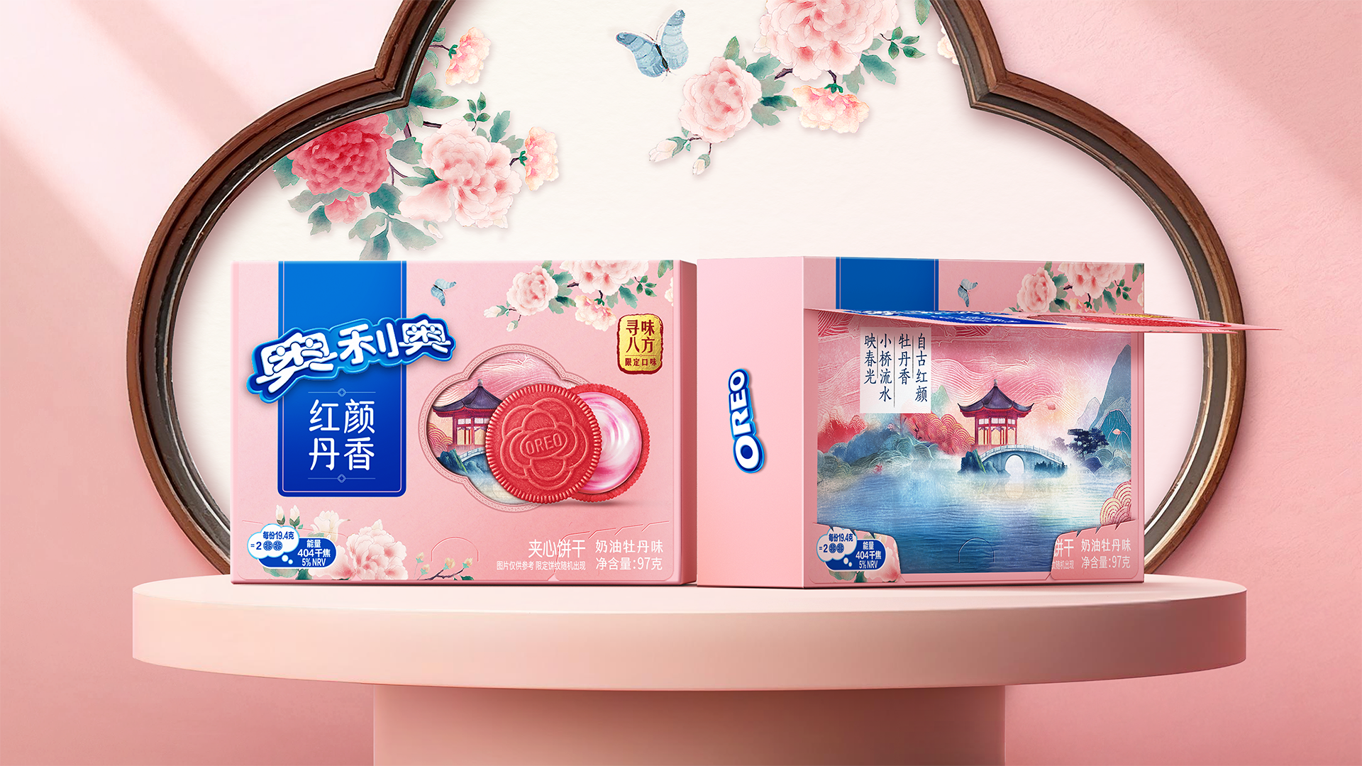
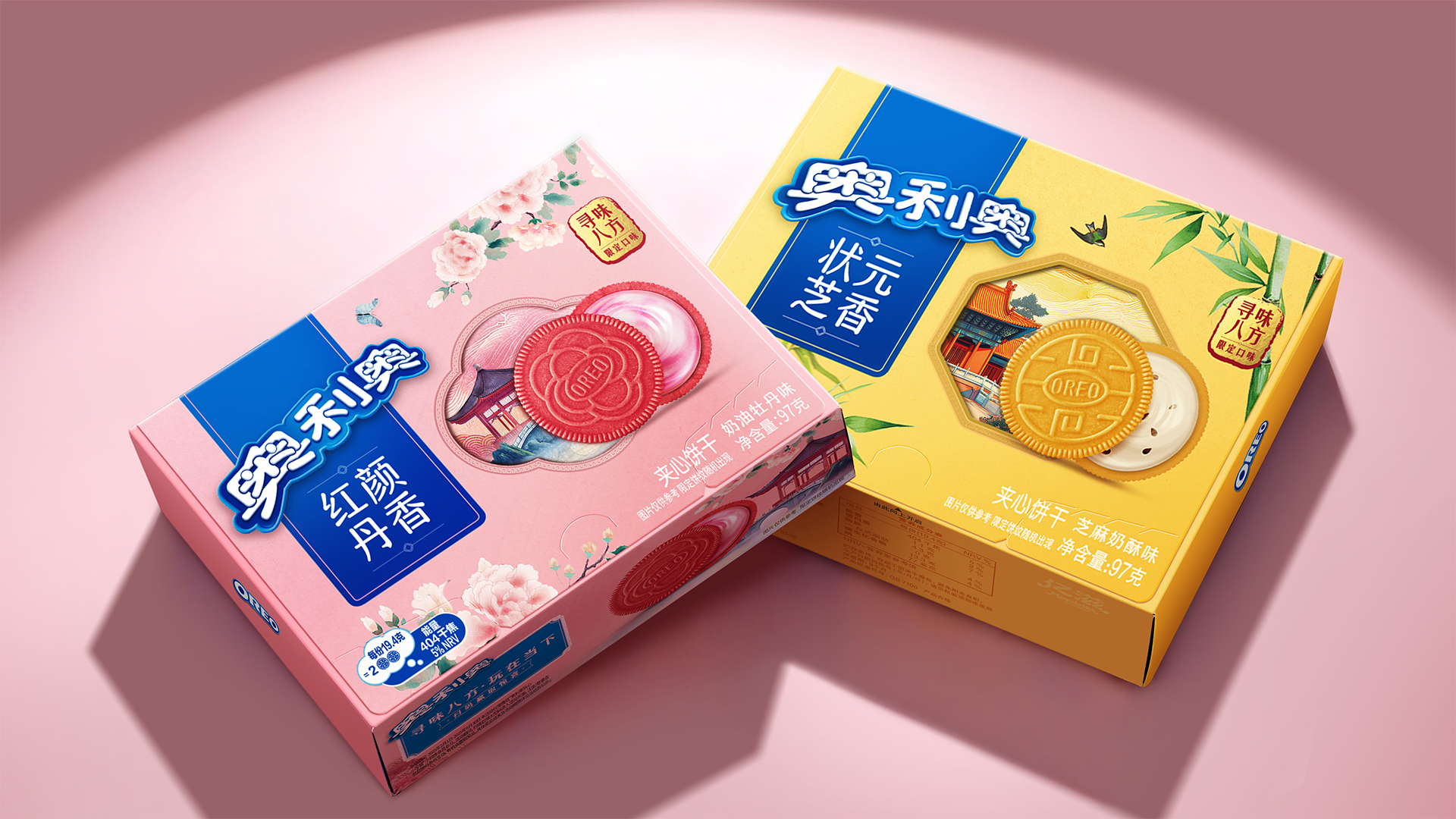
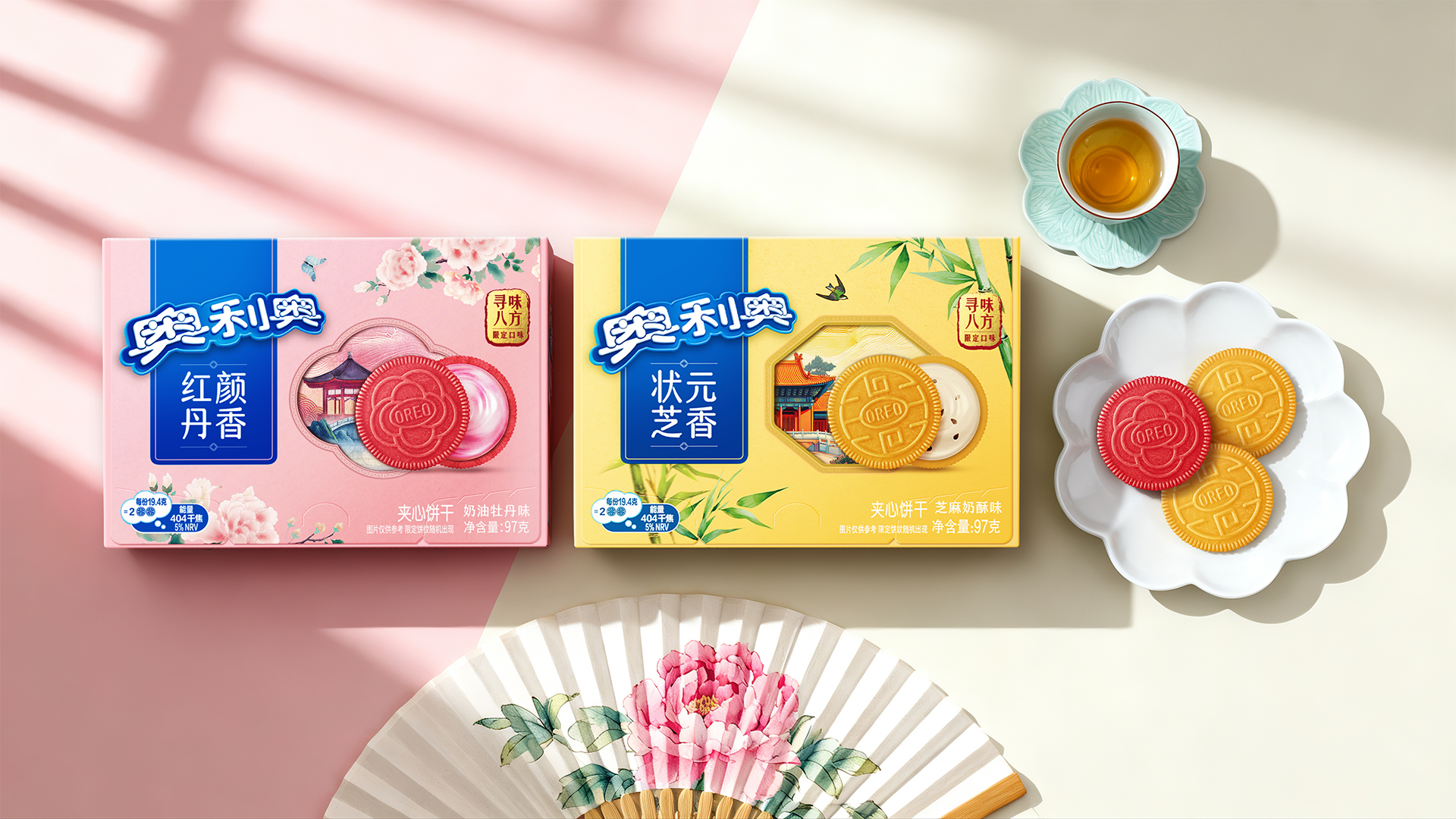
The core creative idea lies in integrating regional culture with flavor and packaging design. The product innovatively developed two signature flavors representing the northern and southern culinary cultures: "Bloom of the Red Peony" (inspired by the afternoon tea tradition in Jiangnan gardens, featuring a creamy peony flavor) and "Scholar’s Sesame Aroma" (inspired by imperial court afternoon tea, with a rich sesame flavor). At the same time, six cultural landmarks—the Temple of Heaven in Beijing, Shanghai’s Shikumen architecture, Hangzhou’s Three Ponds Mirroring the Moon, Wuhan’s Yellow Crane Tower, Suzhou’s classical gardens, and the black-canopied boats of Wuzhen Watertown—have been intricately crafted into limited-edition biscuit patterns using micro-engraving techniques. The act of "twisting" the biscuit has been reimagined with the new meaning of "opening a window," creating an immersive experience of "tasting the regions" through both flavor and sight.
The outer packaging adopts a "New Chinese" aesthetic, featuring an ink-wash diffusion background and detailed brushstrokes of gongbi painting to depict spring scenery, resulting in a sophisticated and artistic overall style. The product design inherently encourages social sharing and "check-ins." The vibrant visuals and highly recognizable landmark patterns directly motivate consumers to bring the product to the actual sites for photo opportunities or share the "blind box"-like experience on social media.
Market Performance
The core creative idea lies in integrating regional culture with flavor and packaging design. The product innovatively developed two signature flavors representing the northern and southern culinary cultures: "Bloom of the Red Peony" (inspired by the afternoon tea tradition in Jiangnan gardens, featuring a creamy peony flavor) and "Scholar’s Sesame Aroma" (inspired by imperial court afternoon tea, with a rich sesame flavor). At the same time, six cultural landmarks—the Temple of Heaven in Beijing, Shanghai’s Shikumen architecture, Hangzhou’s Three Ponds Mirroring the Moon, Wuhan’s Yellow Crane Tower, Suzhou’s classical gardens, and the black-canopied boats of Wuzhen Watertown—have been intricately crafted into limited-edition biscuit patterns using micro-engraving techniques. The act of "twisting" the biscuit has been reimagined with the new meaning of "opening a window," creating an immersive experience of "tasting the regions" through both flavor and sight.
The outer packaging adopts a "New Chinese" aesthetic, featuring an ink-wash diffusion background and detailed brushstrokes of gongbi painting to depict spring scenery, resulting in a sophisticated and artistic overall style. The product design inherently encourages social sharing and "check-ins." The vibrant visuals and highly recognizable landmark patterns directly motivate consumers to bring the product to the actual sites for photo opportunities or share the "blind box"-like experience on social media.
Material(For concept works, please choose the material you plan to use)
纸质 Paper
Craft
Carton box