
Type of applicant company
设计机构
Country
中国
Company Website
www.the25s.com
Images
Brand of the Product
无
Designer Name
The 25s Creative Team
Position of Designer
无
Target Consumer
The primary target audience consists of high-income, young family shoppers (such as mothers) who go to Sam’s Club for shopping. They value imported premium snacks that can be taken and shared at home and to other friends. Consumers look at exciting and impactful packaging from international brands that they cannot get in their more local or regional supermarkets – they equally value this alongside overall taste appeal.
Distribution Channels
小型商超和便利店 Supermarket & CVS
Positioning
大货消费品 Mass Production
Design Story
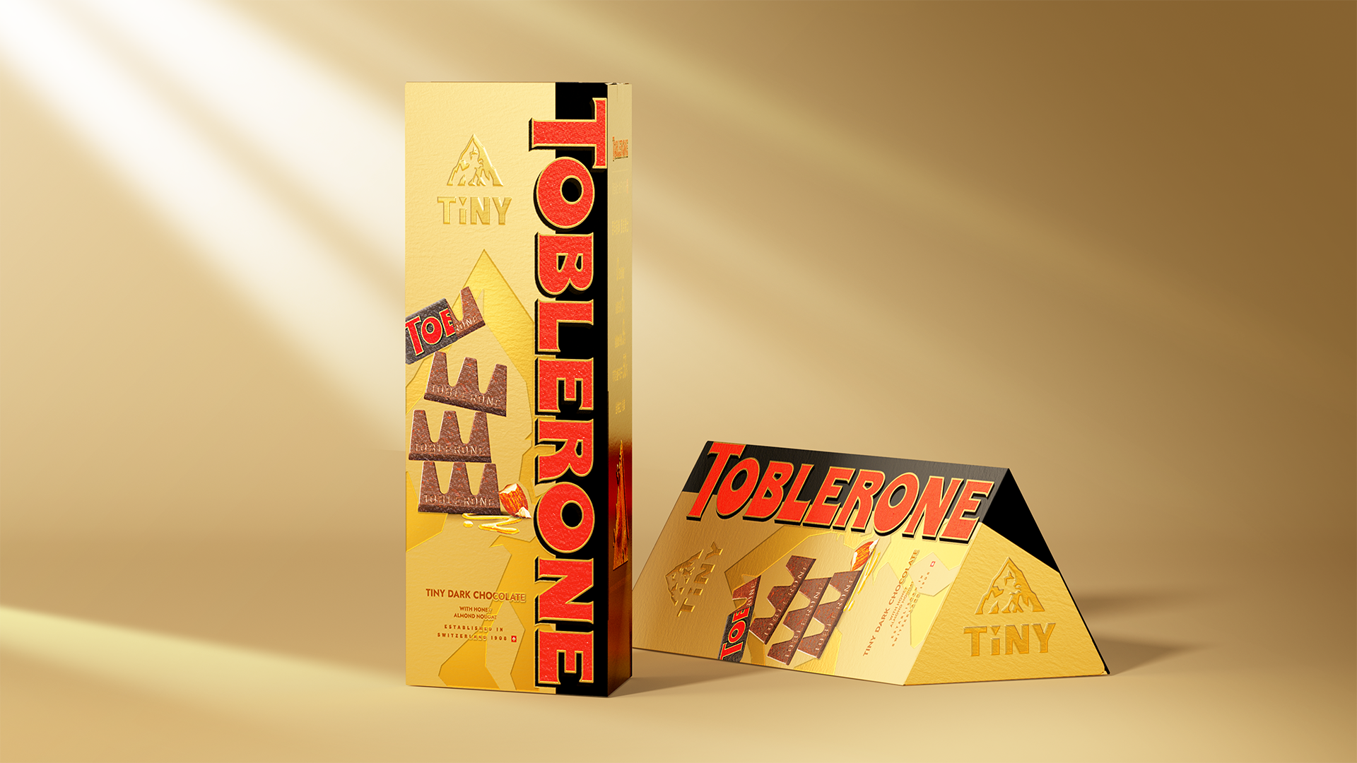
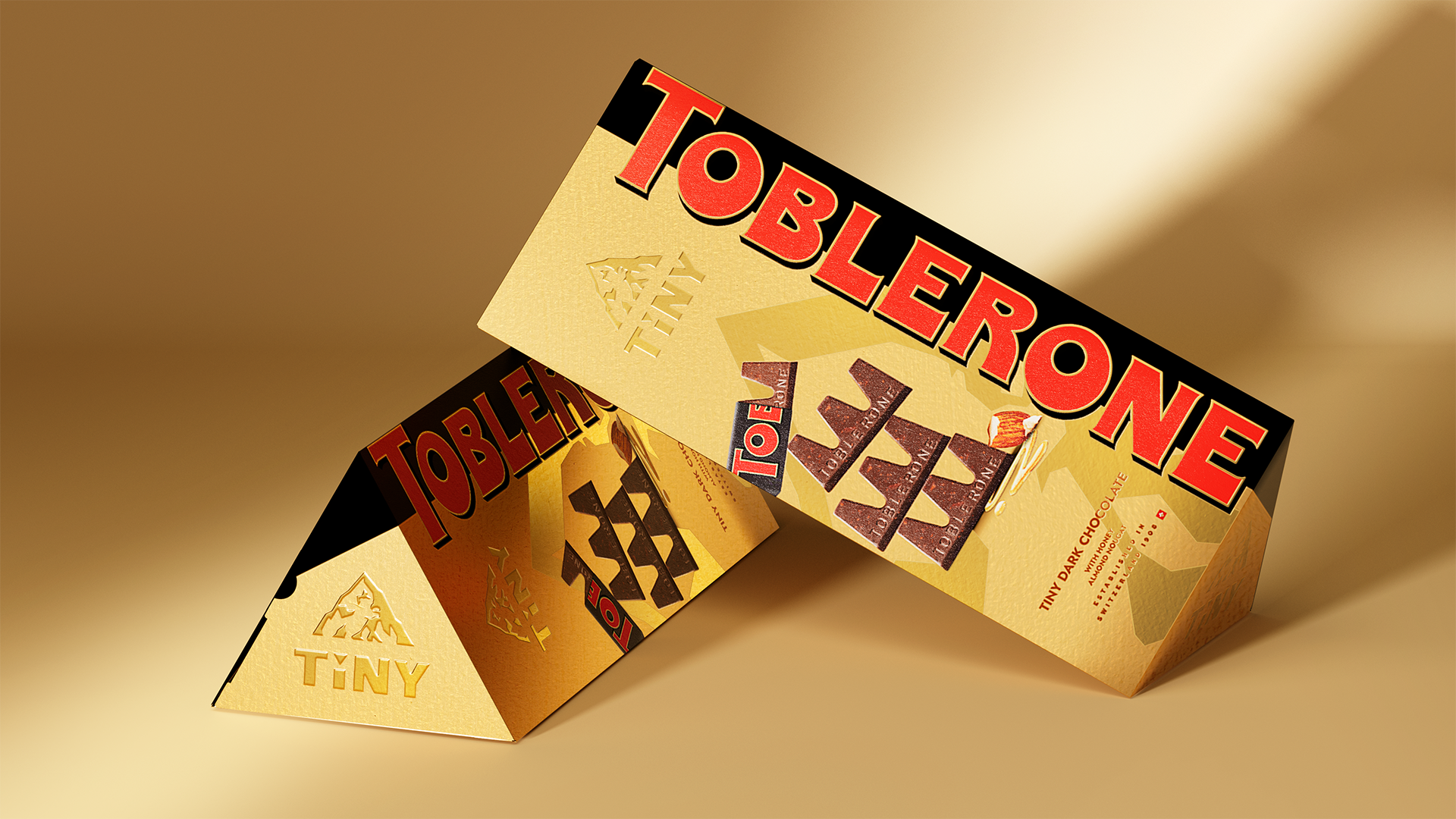
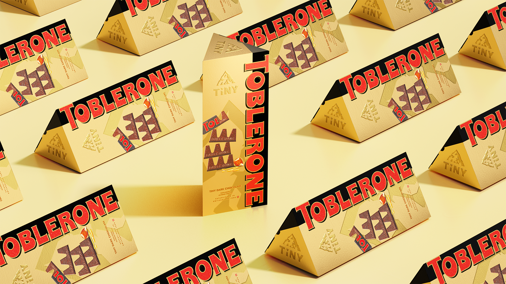
How can a classic Swiss chocolate brand stand out on crowded imported shelves? Toblerone Tiny is a miniature version of the classic Swiss triangular chocolate, perfect for family sharing and gift-giving occasions. Sam’s Club China is renowned for its large-format, high-quality products, providing a great opportunity to create a standout image for Tiny among middle- and high-income customer segments. Our design draws inspiration from the brand’s iconic triangular shape and visual elements, and enhances the sense of luxury and appetitive appeal through more artisanal packaging details, allowing it to stand out on the competitive shelf.
Highlights
The competition for shelf space in Sam’s Club is extremely intense, with numerous brands vying to create the most prominent, eye-catching “shelf markers.” The visual noise is extremely high, making it easy for products to get lost. We presented a clear perspective to the Toblerone team: when all brands are competing for the “most unique and dazzling” spot, genuine uniqueness tends to disappear. For a classic brand, what truly builds differentiation has never been about chasing short-term trends or flashy visuals; rather, it has always been the brand’s accumulated assets over the long term, which are the brand’s true “memory anchors”
Prior to entering the design phase, we conducted a systematic review of Toblerone’s brand assets to thoroughly analyze which elements could maximize value in packaging and design. We focused on its highly recognizable brand colors, iconic triangular shape, prominent red primary logo, and Alpine mountain graphics, and used these insights to create a map of potential opportunities in both structural and visual dimensions. Based on these insights, we established a clear product positioning for Toblerone Tiny: a high-end snack experience that combines elegance with confidence.
Although this development focused on the large-capacity packaging for family sharing, we intentionally retained Toblerone’s most iconic triangular shape, allowing it to stand out naturally on store shelves without relying on complex or noisy visual elements. The classic structural language, combined with more refined and artisanal details, enables the packaging to convey a sense of luxury while also making the brand itself the “loudest voice,” simplifying complexity and reinforcing Toblerone’s unique distinction on imported chocolate shelves.
Market Performance
The Toblerone Tiny wrapper is well-suited for gift-giving scenarios, helping with sales. The new product received significant attention from customers during its first month as a featured item in the DB schedule. Sales increased by over 200% during the first week of the schedule, marking its return to the channel after two years.
Material(For concept works, please choose the material you plan to use)
纸质 Paper
Craft
Gold foil card + hot stamping