
Type of applicant company
品牌方
Country
中国
Company Website
无
Images
Brand of the Product
Xiangshang Shike
Designer Name
XiangShang Shike Design Team
Position of Designer
无
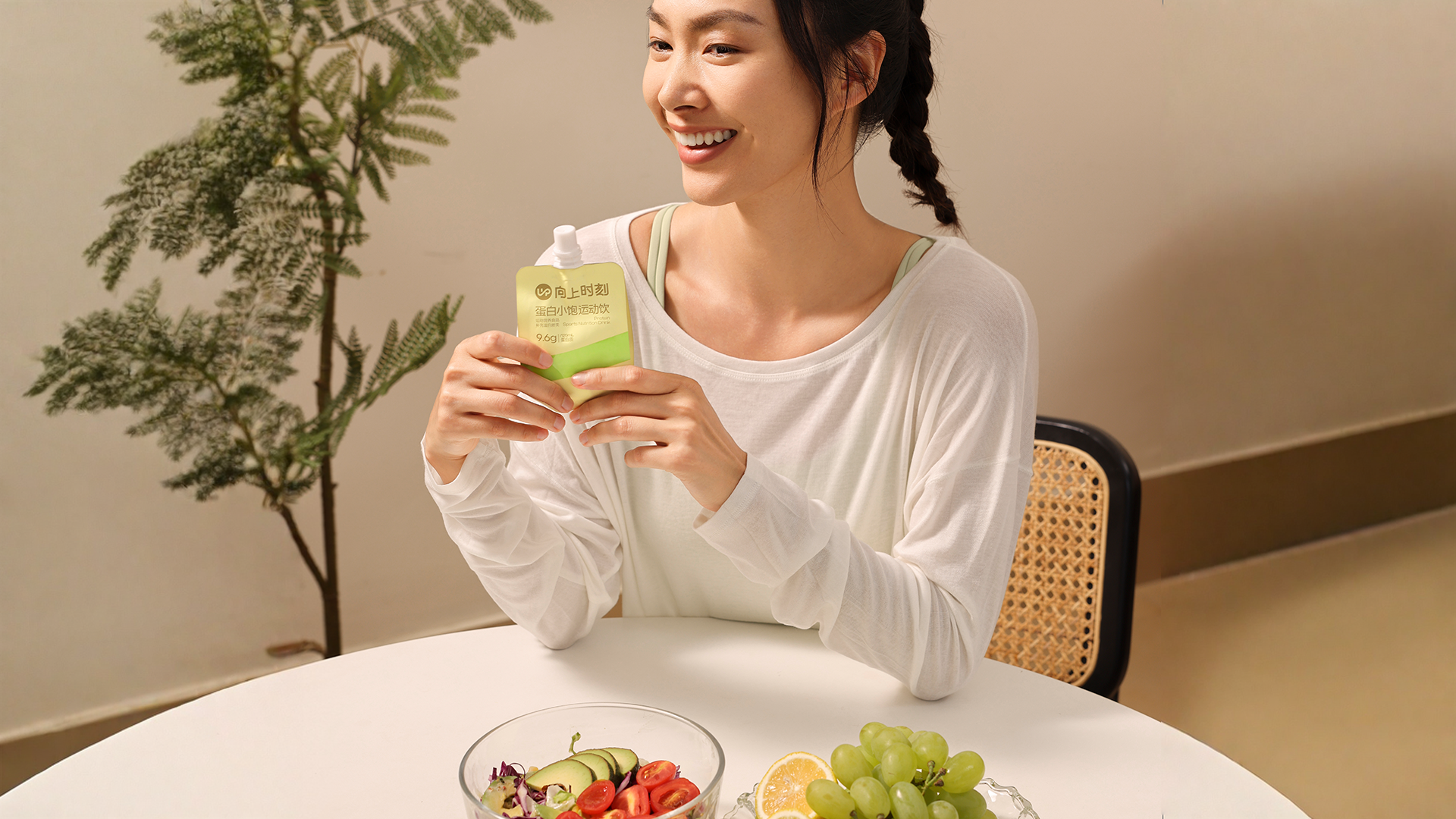
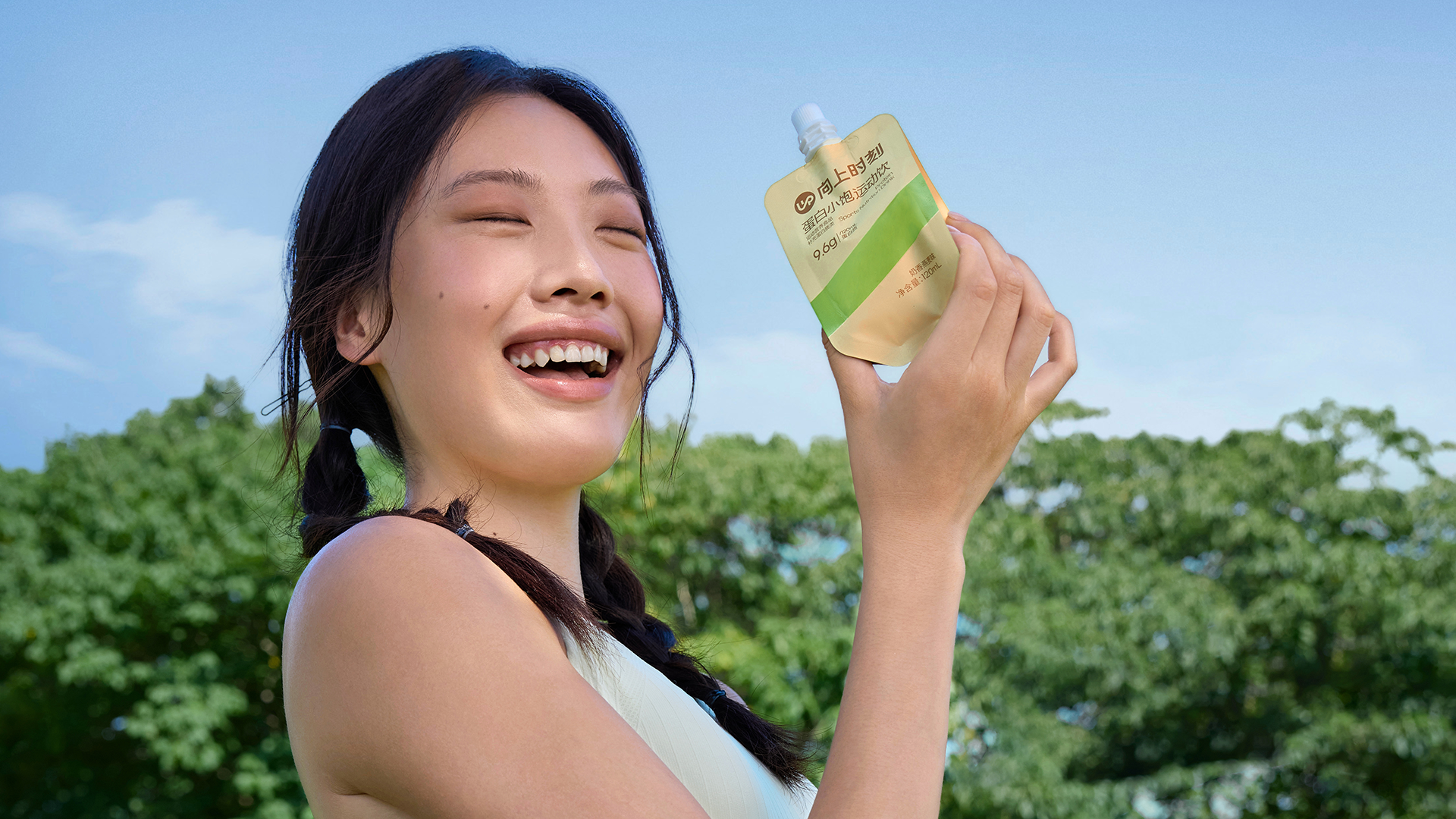
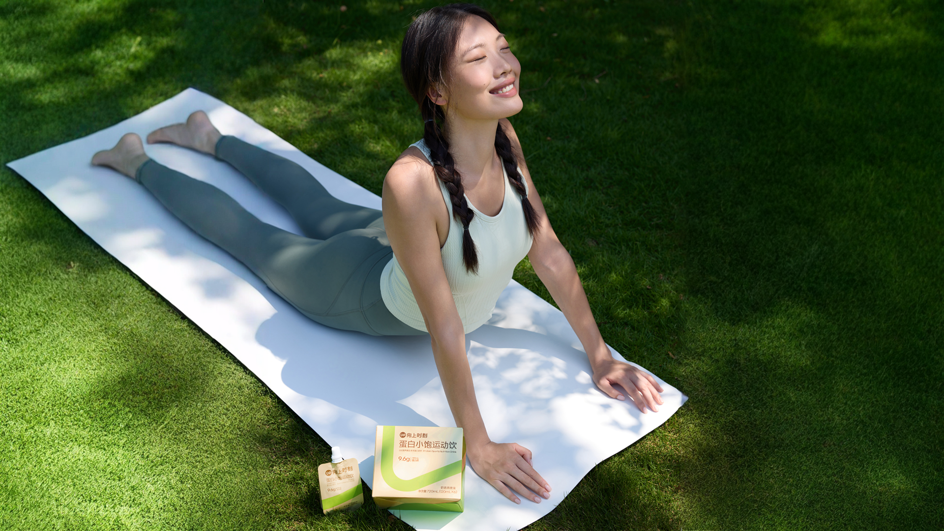
Target Consumer
Young women aged 25-35 in first and second-tier cities, including sophisticated mothers and white-collar workers, who pursue a healthy and quality lifestyle, enjoy trying yoga and other sports in their spare time, and hope to relieve work and life stress.
Distribution Channels
电商 E-commerce; 其他销售渠道 瑜伽馆 私域
Positioning
大货消费品 Mass Production
Design Story
After an in-depth survey of 1,024 yoga and Pilates practitioners, we identified a dual dilemma they face in weight management: moderate exercise intensity yet substantial energy consumption needs, paired with the poor portability and heavy taste of traditional supplements. Most sports nutrition products on the market target high-intensity muscle building (explosive exercise scenarios), and there is a lack of a lightweight, yoga-specific solution tailored to low-to-moderate intensity workouts and the pursuit of physical and mental balance.
This work adheres to the core design philosophy of Pure, Balanced, and Burden-free:
Visual Language
We use the iconic natural oat color as the base, complemented by dynamic upward "UP" stripes outlined in the vibrant brand green. This color scheme not only intuitively evokes the sensory expectation of oat milk flavor but also visually eliminates the medicinal or industrial feel of functional supplements, blending seamlessly with the soothing ambiance of yoga studios.
Form Innovation
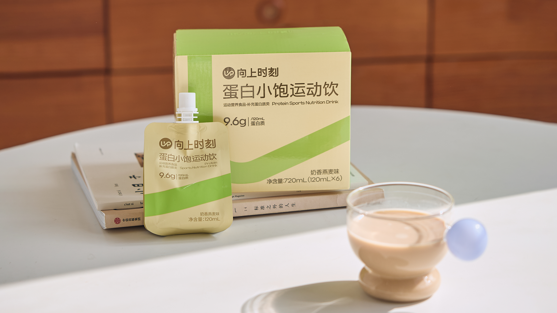
Abandoning bulky traditional bottled packaging, we adopted a 120ml lightweight portable spout pouch design. This form fully caters to practitioners' fragmented time—whether switching yoga poses, taking inter-class breaks, or commuting—and delivers the ultimate convenience of one-hand opening and instant replenishment.
Sensory Philosophy
The design extends to the taste dimension. We believe that a pleasant flavor is the motivation for consistent use. The oat flavor, refined in our sensory lab, is paired with a zero-sucrose, zero-preservative formula, allowing consumers to truly experience physical and mental lightness with every sip. It aligns perfectly with the brand's philosophy of enjoying every moment of movement.
Highlights
In terms of user experience
This product comes in a 120ml ultra-light, minimalist streamlined spout pouch, ergonomically shaped for one-hand grip. Paired with an easy-open, ready-to-drink design, it ensures safety and hygiene. It resolves the pain points of unhygienic repeated scooping with bulky traditional powder jars and the inconvenience of carrying heavy, cumbersome bottled liquid protein. The pouch fits seamlessly into yoga bags or travel scenarios, enabling practitioners to replenish efficiently in a light and pleasant way.
Market Performance
The overall channel layout adopts a combination of online and offline channels, with offline channels and private domains as the core. Since its launch in May 2025, the cumulative sales volume has exceeded 1 million RMB.
Material(For concept works, please choose the material you plan to use)
PET塑料 PET material; 纸质 Paper
Craft
This packaging centers on the needs of yoga practitioners, balancing functionality and aesthetics. The outer box uses a substrate of corrugated board laminated with white card, which not only meets the load-bearing requirements of liquid protein drinks but also provides a delicate texture base for visual presentation. The box surface combines reverse UV, flat UV, and embossing processes to create matte and glossy light-and-shadow layers, complemented by a three-dimensional embossed texture to enhance brand recognition. The inner pouch applies local gloss lamination to precisely highlight the brand’s green visual lines, making the portable pouch more recognizable in scenarios and conveying the product experience of "lightweight replenishment" through refined details.