首页
作品精选
产品赛道
包装赛道
营销赛道
赛制
时间节点
赛道介绍
参赛权益
提名权益
获奖权益
权益对比
产品赛道
包装赛道
营销赛道
参赛费用
知识产权声明
评委
产品赛道
2025
包装赛道
2025
营销赛道
2025
新闻资讯
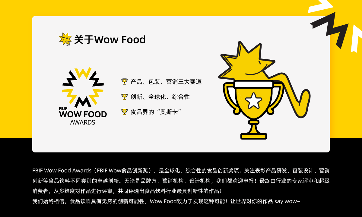
关于
关于FBIF赛事
合作伙伴
合作媒体
联系我们
报名参赛
登录
EN
谁能俘获创意大师的心?Wow Food 2025营销赛道首批评委阵容揭晓!
2025-02-12
Wow Food包装评委阵容首发!全球视角解读包装新趋势 | Wow Food 2025特辑
2025-01-17
重磅官宣 | FBIF Wow食品创新奖2025报名正式开启!
2024-09-04
Wow Food 2024获奖揭晓!196件获奖作品,直击全球食品创新前沿!
2024-07-09
合作伙伴
合作媒体