
Country
中国(China)
Official website
http://m.warmlightbrand.com
Company Introduction
Established in 2015, Warm Light Design has eight years of experience in new retail brand building and 18 years in comprehensive brand development. Focusing on overall brand building in new retails, we build brands from a multidimensional perspective—from brand positioning to visual tone presentation—with full and professional execution capability to promote the holistic brand construction from 0 to 1. Since its establishment, we have built and cooperated with many zero-to-one new retail brands. We have also provided comprehensive services to many ten-billion-yuan-scale companies, involving brand rejuvenation, specialisation, and packaging systematisation. At Warm Light Design, we help our clients determine their brand position in the market, create an exclusive brand visual image and provide more in-depth brand layouts and strategic advice.
Images
Brand Name
无
Designer Name
Wramlightbrand
Position of Designer
Designer
Client
无
Target Group
Our primary target audience is urban white-collars who pursue quality and healthy life and care more about product ingredients. Our core consumer group is highly-educated women and mothers, as well as people who need sugar control.
Major sales
电商 E-commerce; 大型商场 Shopping Mall; 小型商超和便利店 Supermarket & CVS
Positioning
大货 Mass Production
Design Story
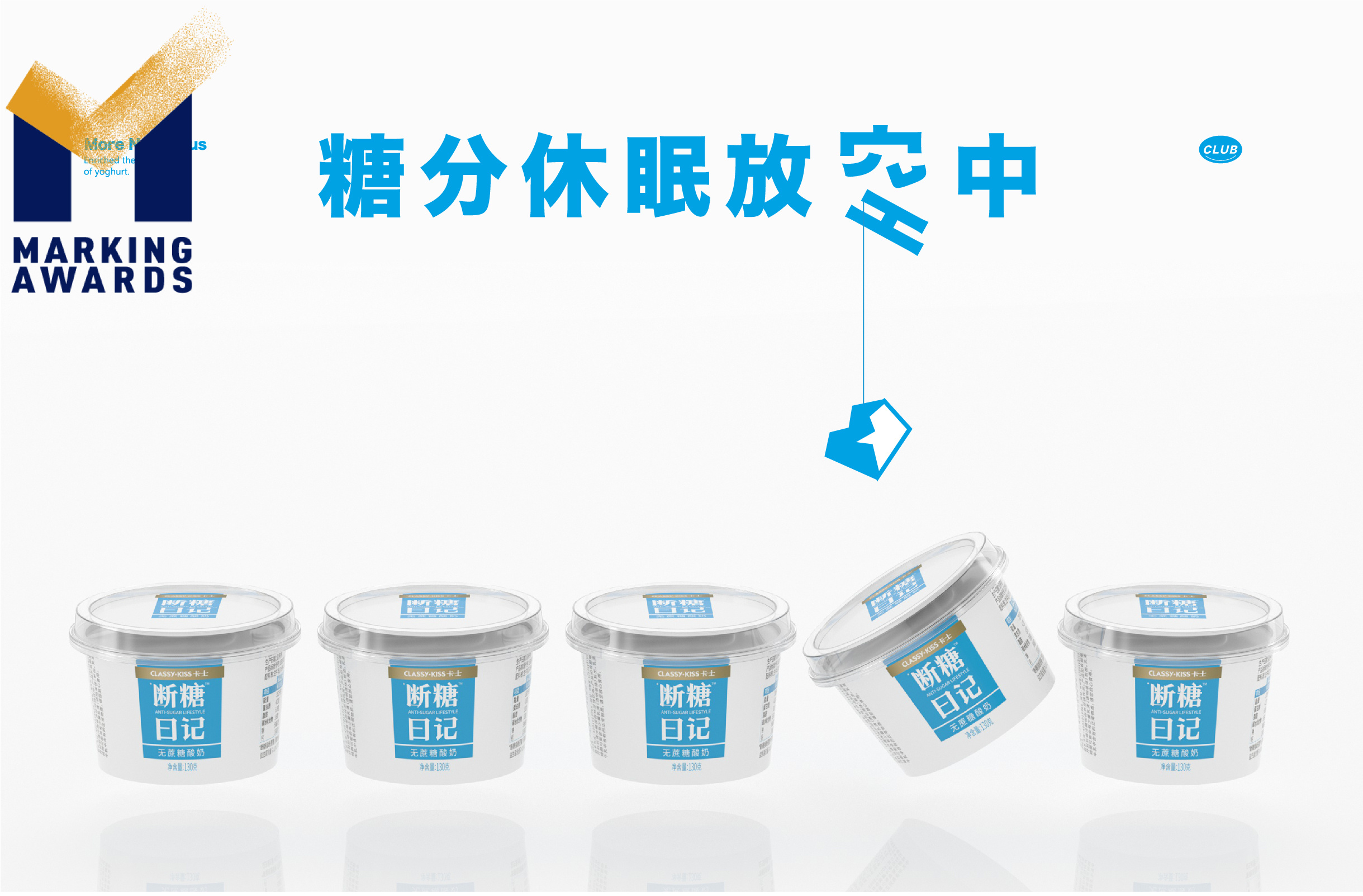
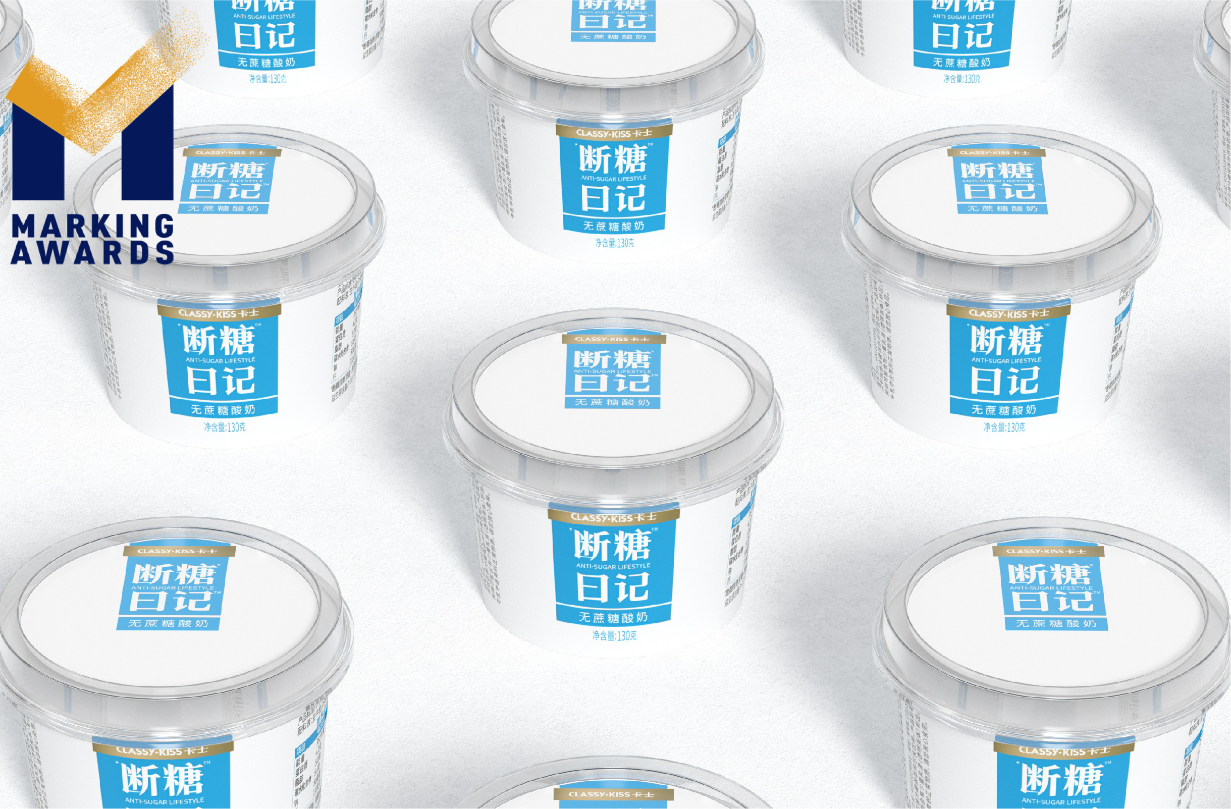
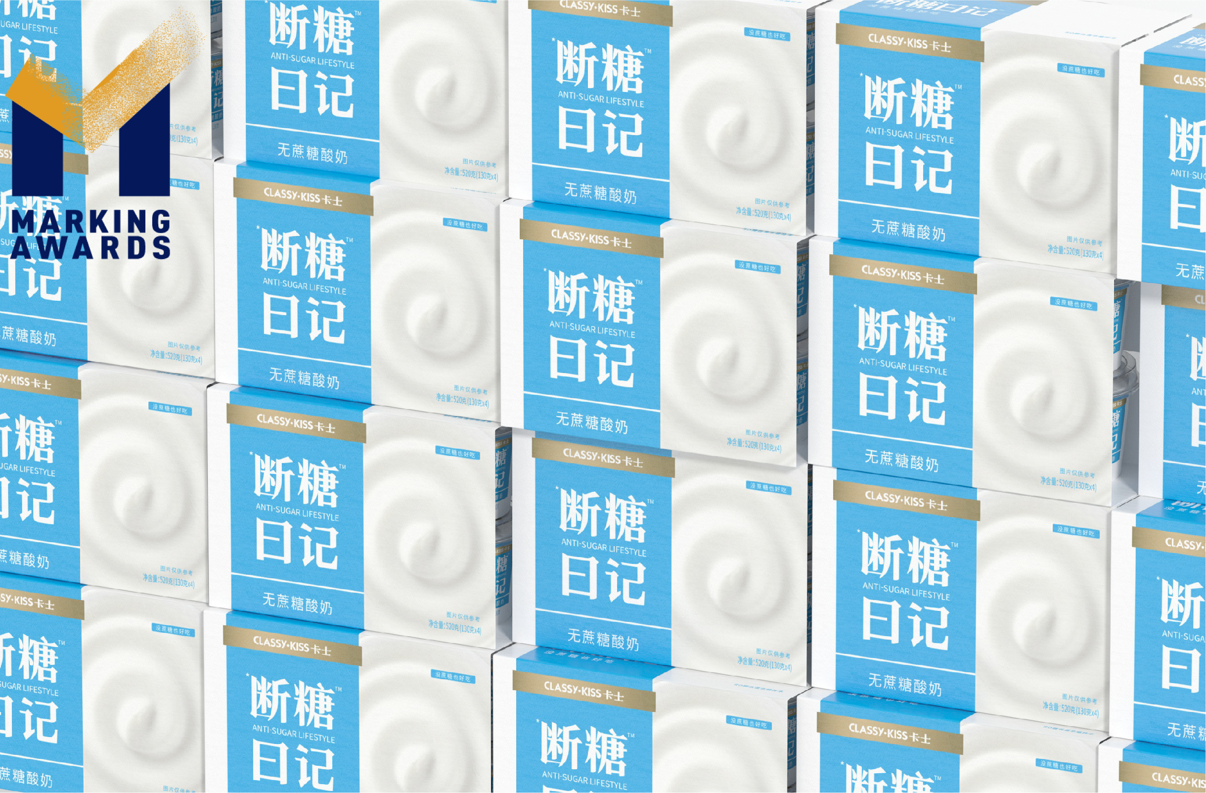
With innovation being its core competitiveness, Classy Kiss always focuses on high-quality yogurt. In 2020, carried by the wind of a "sugar-free" market trend, it launched a new product, Sugar-Free Diary (断糖日记), and entrusted us with its visual packaging design. To highlight the product's core selling point while integrating a high-quality brand image, we inherit Classy Kiss’s minimalist style and, at the same time, try to rejuvenate, delivering a sense of health in line with the needs of sugar-free people and product positioning. In terms of colour selection, we employ a clear sky blue to interpret the core selling point of sucrose-free and additive-free products. In design details, we try to distinguish it from the extensive use of negative space in the original packaging by using large solid colour blocks, a creative visual expression of frozen products rather than conventional monotonous cold white, making its shelf identity more prominent.
Highlights
This time, our packaging vision created for Classy Kiss Sugar-Free Diary breaks the visual stereotype of conventional frozen dairy products. On top of realising the essential communication of product selling points, we employ sizeable blue colour blocks to create visual focus and memory points so that the product can effectively stand out on the shelf.
Market Performance
无
Material
PET塑料 PET material
Craft
无
Does the design solve the problems that are common across the product category?
TThe visual display of most frozen product packaging in the market uses predominant negative space, giving consumers a cold, monotonous and hard-to-identify purchasing experience. Our packaging design uses large blue colour blocks to create product memory points and visual focus points while retaining the brand tonality and a high-quality product image to make Classy Kiss Sugar-Free Diary stand out on the shelf. As a result, it is convenient for consumers to quickly identify and select the product, creating a product sales highlight.