
Country
中国(China)
Official website
https://meta-liquor.com
Company Introduction
Between Cups (Shanghai) Food Technology Co., Ltd. is a cutting-edge brand that uses technology to empower beverages. At present, we focus on developing a brand new RTD product based on Chinese liquor—Baijiu, so that Chinese liquor can go beyond traditional symbols and be in line with technological innovation. We connect with consumers through the META LIQUOR, and create RTD Chinese Baijiu with artistic collection value for them, so as to obtain a new consumption experience of freedom, sharing and openness.
Images
Brand Name
Meta Liquor
Designer Name
Ruilin Fu
Position of Designer
创意总监
Target Group
young people aged 18-30 who have already or plan to enter the workplace. They like drinking to relax in their spare time, love to try new things, love to enjoy freedom, and dare to break unreasonable rules and constraints. When purchasing low absolute price goods, they do not care about whether the price is above average.
Major sales
电商 E-commerce; 小型商超和便利店 Supermarket & CVS; 餐饮&酒店 Restaurants & Hotel; 其他销售渠道 大学社团活动,剧本杀、网咖等年轻化社交娱乐场景
Positioning
大货 Mass Production
Design Story
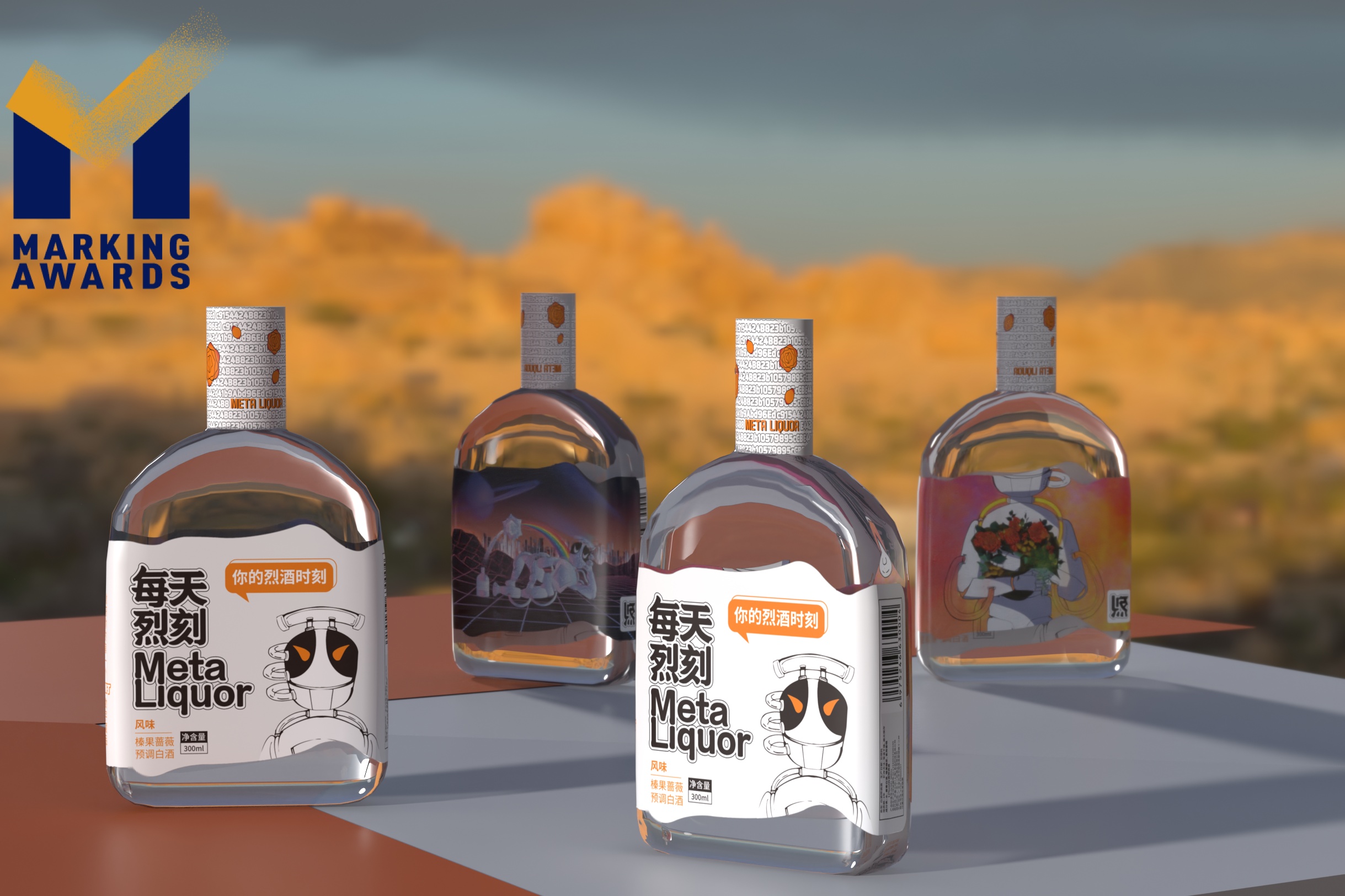
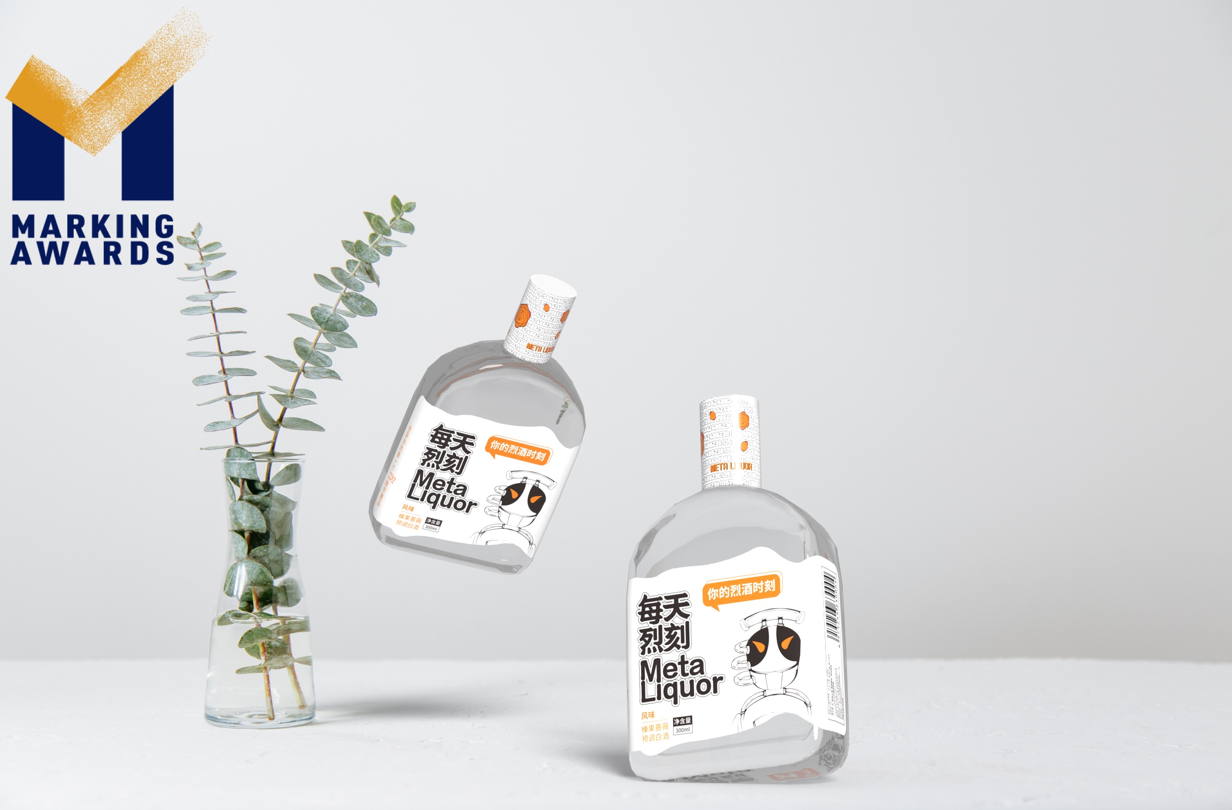
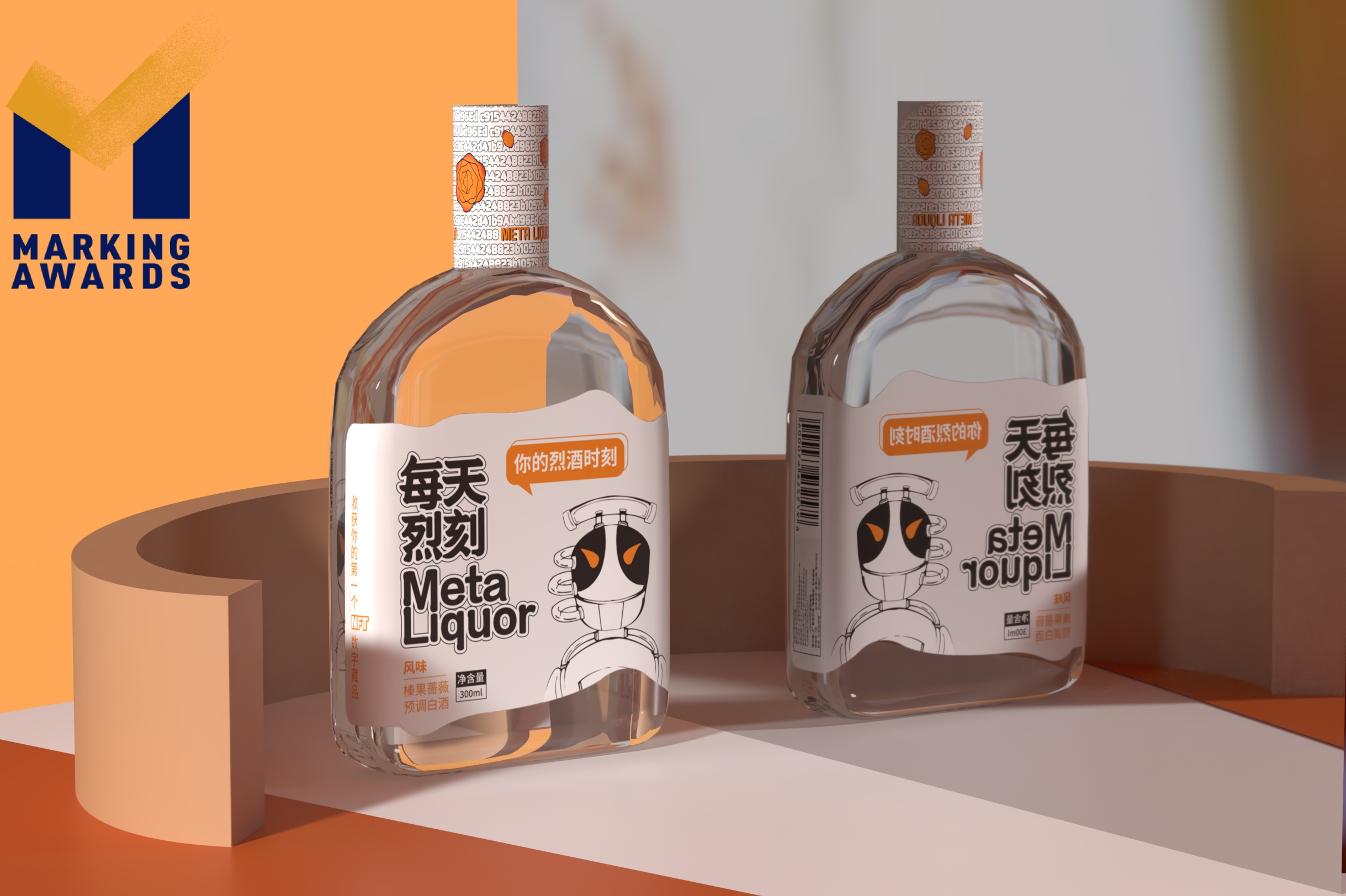
Meta liquor is an RTD that uses Maotai as the basement. Maotai has its own rich and penetrating historical power, and is extremely particular about limpid clear color. However, RTD, as one of the representatives of newly invented drinks considered as “youth power”, prefers compound flavor. Our product, as the liquor mixture of the two, also tries to show the two extremes come crashing together by the appearance design. We want to show our products both have the original and traditional blood from Maotai, the high quality and honorable from Maotai-producing area. In the meanwhile, we hope our product to try to gain youth power and become a brand that is able to let both us and the teens enjoy. Because of this, we hope the tag could be used as a place where connections are built with consumers. The robot IP “Liq” appears on the package is not representative of us, the brand image, however the characteristic showing of the customer. We showed the characteristic of Liq by telling a whole world view and to show the brand identity by the designing of the tag is pursued——created with users, become unusual and follow your heart.
Highlights
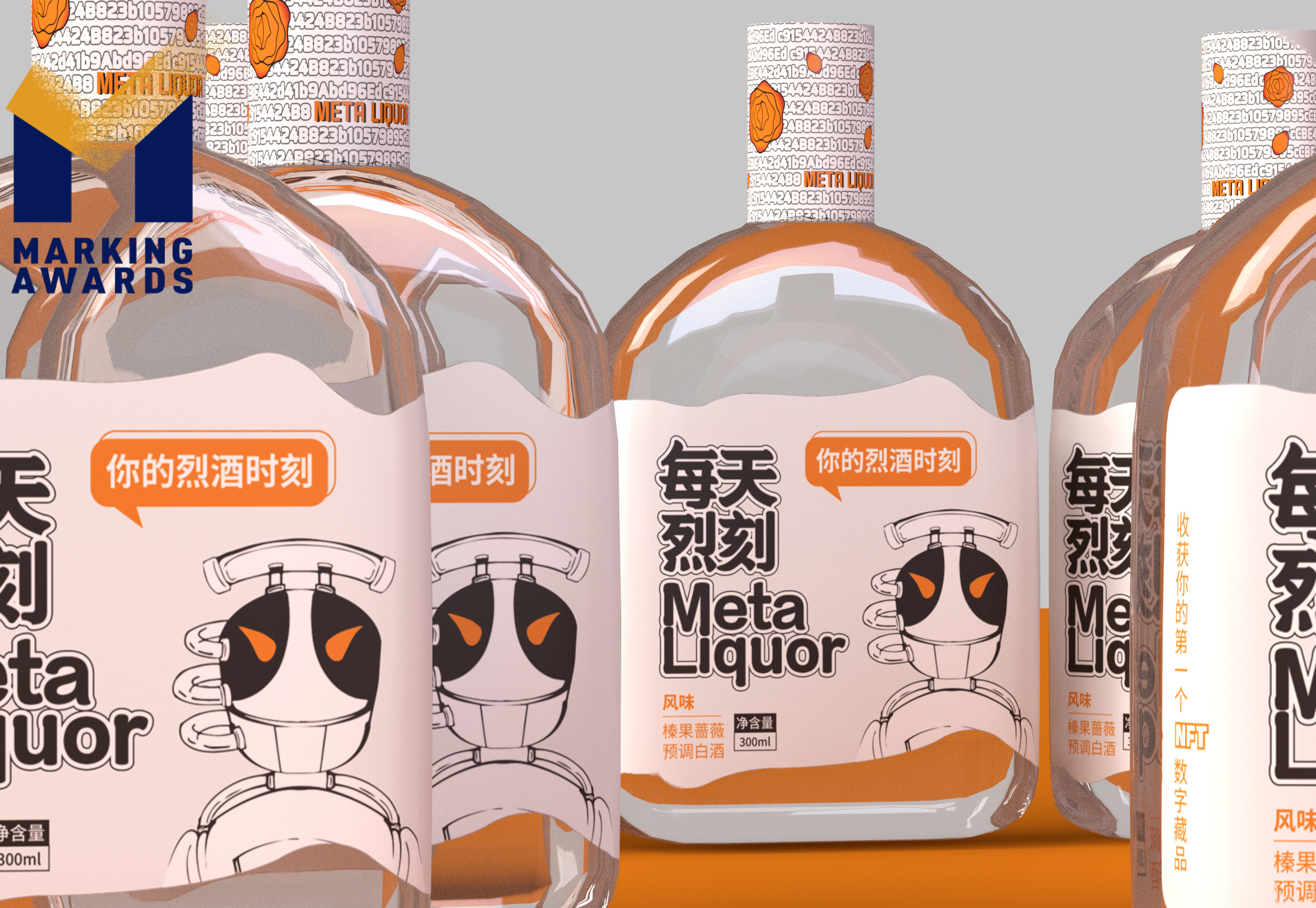
Maotai, brand IP, metaverse, three totally distinct words, how could the collusion of inspiration be? The shape of the label uses the topographic map of Maotai town showing high Maotai basement quality of the product; the irregular design of the map also leaves the design more space, to confirm the traditional concept of Chinese landscape painting called “leave blank”. the label inside also follows on orange-tinted, however, becomes more complex and subtle. A simple outlook and a complex inside were skillfully connected by the robot Liq’s appearance. The inside label is the totally different Liq that is designed and created by different artists. Meanwhile, these works will also have their own place in the metaverse——they will be launched as the digital asset of our brand. And the Contract address of NFT, is right in the neck label of the phsical product.
Market Performance
For users, the product is strange and unknown at the beginning, and there is not much connection with users themselves, so they will not mention the product to their own circle of acquaintances. The brand feature that is strongly engraved every day lies in the joint creation of users - the taste and appearance of the first model are voted by users to participate in decision-making, which greatly strengthens the connection between products and users, and makes users willing to spontaneously share product information in the social circle of acquaintances, which virtually expands the range of potential users. At present, the social logic of acquaintances has been verified. According to this logic, the first trial production product has been sold out. And a number of users spontaneously publicized on multiple social media.
Material
其他
Craft
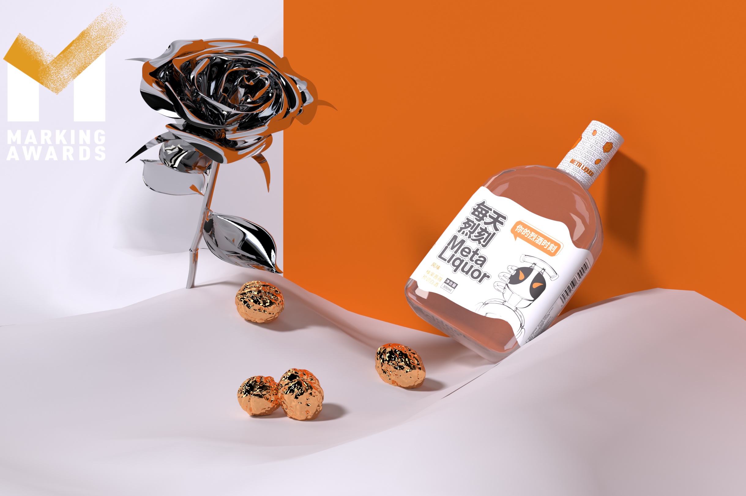
The label is made of irregularly cut double-sided printing special paper with rice paper texture, and the UV process is used to highlight the brand name. The color printing art collection with full color is used inside to show the brand tone of collision and integration inside and outside the brand. The bottle body adopts the highest transparency crystal-white-glass, the oldest and most expensive manual blowing process, trying to contain the classic characteristics on the basis of young design, showing the texture of the base wine from the Maotai-producing area. The label uses irregular cutting double-sided printing special paper to show the brand image of internal and external collision and fusion.
Does the design solve the problems that are common across the product category?
The two common bottle packaging techniques are heat-shrinkable film and machine cap. However, they both have some problems: the gland is hard to unscrew, the heat-shrinkable film is hard to touch, and it is too smooth to hold——consumers could not easily tear the heat-shrinkable film by observing the gap between the bottleneck. Since then, we choose heat shrinkable film packaging design as the neck label, which is less difficult to be held and opened. In the processing technology, we apply steam dring instead of the common wind dring, aiming at making the film be more smooth. The whole shrinkable film is matte with a teat line on it, which helps customers to identify where to open it. So the design definitely decreases customers' cognitive cost.
What functional designs of the work have enhanced the user experience?
The label length will not be completely wrapped on the side, which is beneficial for consumers to observe the complete picture of the internal label.
Did the design help increase the sales performance of the product?
For users, the product is strange and unknown at the beginning, and there is not much connection with users themselves, so they will not mention the product to their own circle of acquaintances. The brand feature that is strongly engraved every day lies in the joint creation of users - the taste and appearance of the first model are voted by users to participate in decision-making, which greatly strengthens the connection between products and users, and makes users willing to spontaneously share product information in the social circle of acquaintances, which virtually expands the range of potential users. At present, the social logic of acquaintances has been verified. According to this logic, the first trial production product has been sold out. And a number of users spontaneously publicized on multiple social media.
Does the work consider sustainability (environmentally or commercially, or both)?
The brand side regularly publishes NFT digital collections, and the sales are publicized on the Ethereum chain. Every year we will donate 1% of NFT sales profit to China greening foundation. This product uses reusable glass bottles to avoid environmental problems caused by aluminum cans and plastic bottles. Use paper labels instead of plastic labels, and do not use film coating processes to achieve environmental protection. Some of the paper labels are printed with IP art paintings, which makes the labels valuable for collection and guides consumers to transition from discarding to collection and display, so as to fulfill the responsibility of environmental protection. After drinking, the empty bottle can be used for a long time without health problems caused by the long-term use of plastic products.
Additional Materials