
Type of applicant company
设计机构
Country
中国
Company Website
wow-cd.com
Images
Brand of the Product
KUMBAT
Designer Name
Zhou Jingkuan
Position of Designer
Chief designer
Target Consumer
25-40 years old young people, the pursuit of quality life, cognition and taste, there is a certain spending power. Not too keen on hard alcohol, prefer pure craft beer, enjoy the solitude of drinking at home or in the pub, and enjoy chatting with a few friends.
Distribution Channels
大型商场 Shopping Mall; 餐饮&酒店 Restaurants & Hotel
Positioning
大货消费品 Mass Production
Design Story
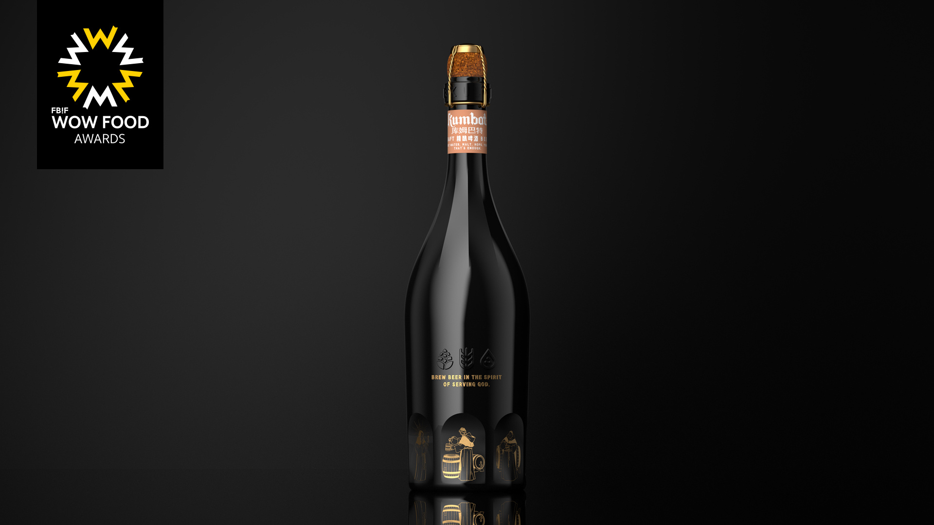
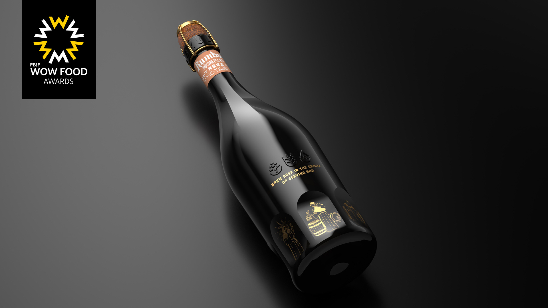
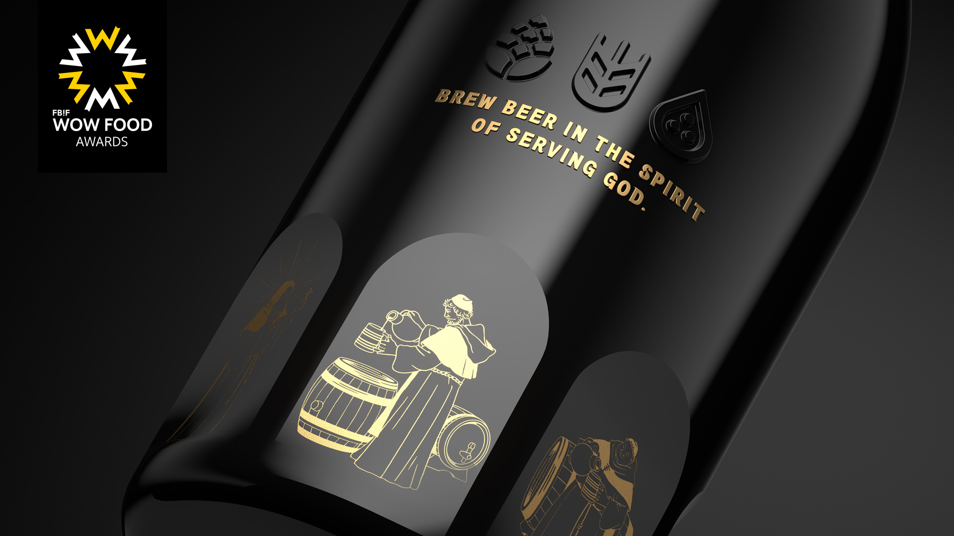
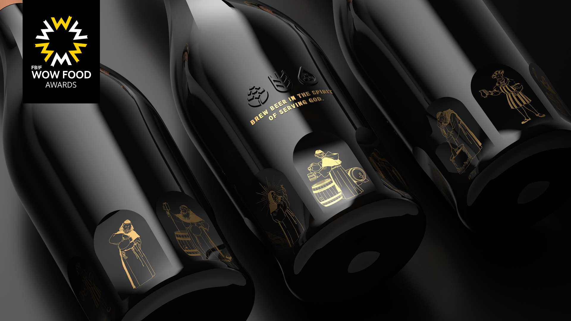
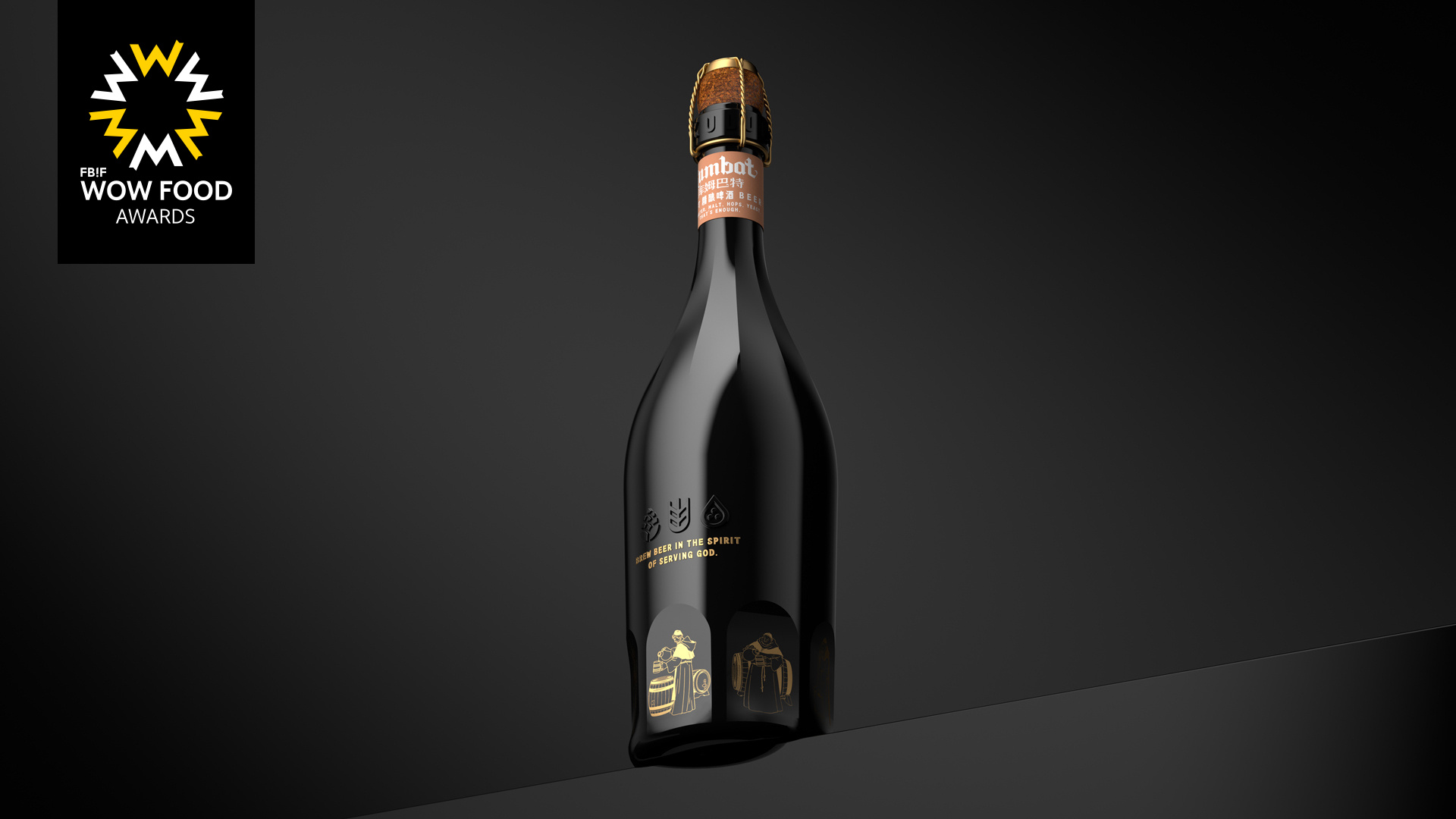
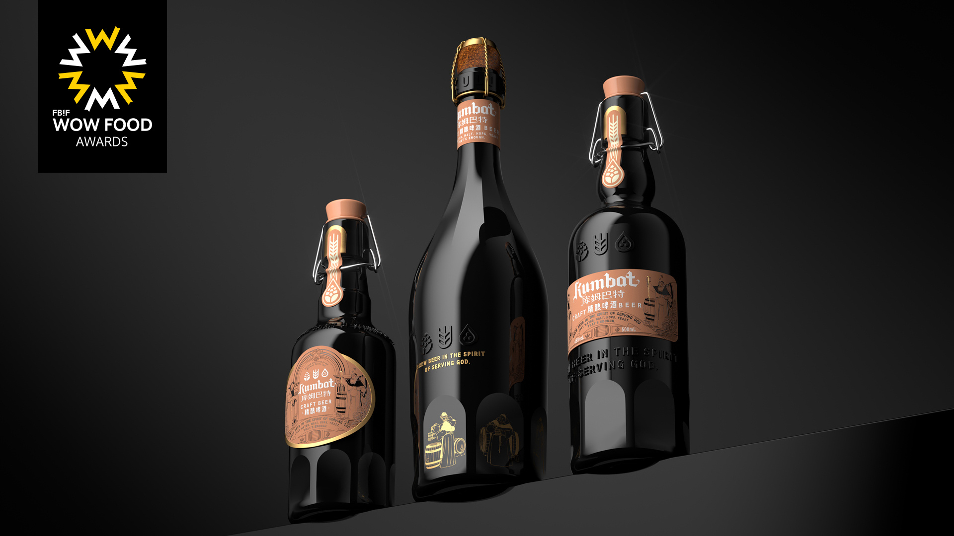
In 1516, William IV, Duke of Bavaria, decreed that only three raw materials could be used in brewing beer: water, malt, and hops (yeast was only allowed after it was discovered). This regulation not only ensures the purity and taste of beer, but also provides standards and guarantees for brewers. All you need to make a good beer is water, malt, hops and yeast. The history of beer making in Germany is tied up with churches and monks who were almost as committed to brewing as they were to God. Only beer and faith should not be disappointed, with the spirit of serving God to brew beer. This is exactly the brand concept pursued by kumbat brand.
Highlights
The unique feature of this packaging design is the story of monastic and monastic beer, which is easy to attract the attention of Chinese consumers and let them understand the history of German beer brewing. The main market of the product is China, and the packaging design reflects the development history of German beer, which is almost never done by other brands, and the different cultural communication makes the product different.
Market Performance
no
Material(For concept works, please choose the material you plan to use)
其他 玻璃
Craft
Colored glass mold, decal baking process.
Does the design solve the problems that are common across the product category? If so, please explain.
In similar craft beers, the high-end attributes presented by the packaging design are not prominent, and the most common is to use the universal bottle shape to make a difference by changing the graphic design of the label. Kumbat made a change in the shape of the bottle, by integrating the elements of the monastery to carry out a unique bottle design, and the brewing monks were placed in the arch representing the monastery, and the logo representing hops, wheat and water was embossed on the bottle. The visuals presented here not only convey the story of the monastery brewing high-quality beer, but also convey the brand pursuit of Kumbart inheriting the German 1516 pure brewing method and advocating pure craft brewing.
What functional designs of the work have enhanced the user experience?
The simple Abbey arch element of the bottle design, picking up this bottle of wine, as if reading the brewing history of German Abbey beer, makes this bottle more precious when opened.
Does the work consider sustainability (environmentally or commercially, or both)? If so, please explain.
This is a classic product that will not easily change the appearance of the entire package, but also provides a sustainable solution for the extension of the package, such as doing different design extensions at the neck label, so that this product has more visual possibilities.