
Type of applicant company
品牌方
Country
中国
Company Website
www.coca-colacompany.com/cn
Images
Brand of the Product
“Minute Maid”
Designer Name
1.Design bridge and partners 2.SHANGHAI JBHB ADVERTISING COMPANY LIMITED
Position of Designer
无
Target Consumer
Today's main juice and juice beverage consumers, aged 20 to 39, are preoccupied with fast-paced lives every day, but find themselves trapped in dull and flavourless routines. They long for life's wonders to bring them more enriching experiences.
Distribution Channels
电商 E-commerce; 大型商场 Shopping Mall; 小型商超和便利店 Supermarket & CVS; 杂货店 Grocery; 餐饮&酒店 Restaurants & Hotel
Positioning
大货消费品 Mass Production
Design Story
The new generation of Chinese consumers don’t only value functionality, but increasingly focus on emotional value as well. Meanwhile, the juice and beverage categories have also seen a constant influx of new players. In this context, while consumers have more and more choices, they also face increasingly dazzling shelves and a tougher decision-making process.
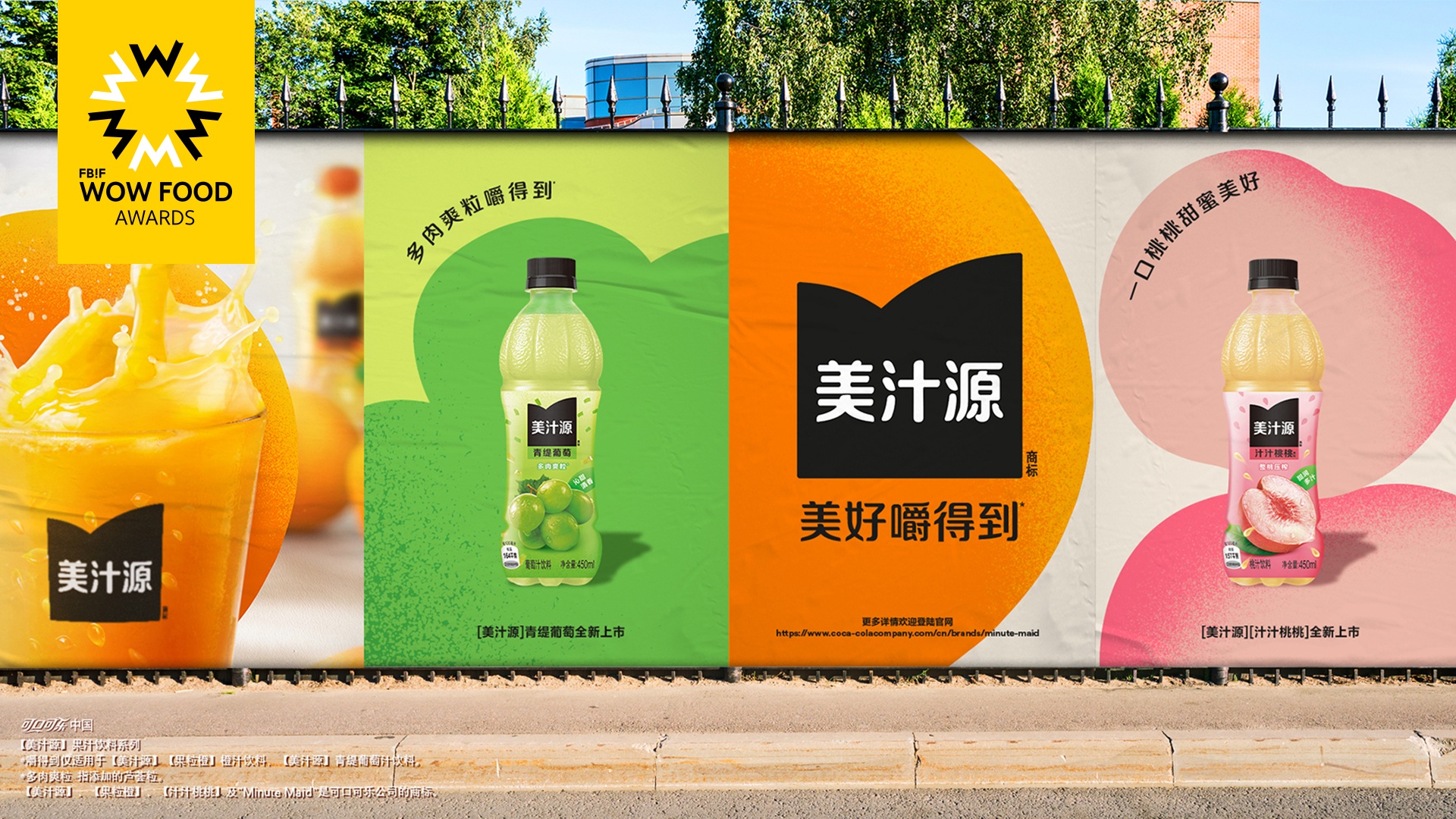
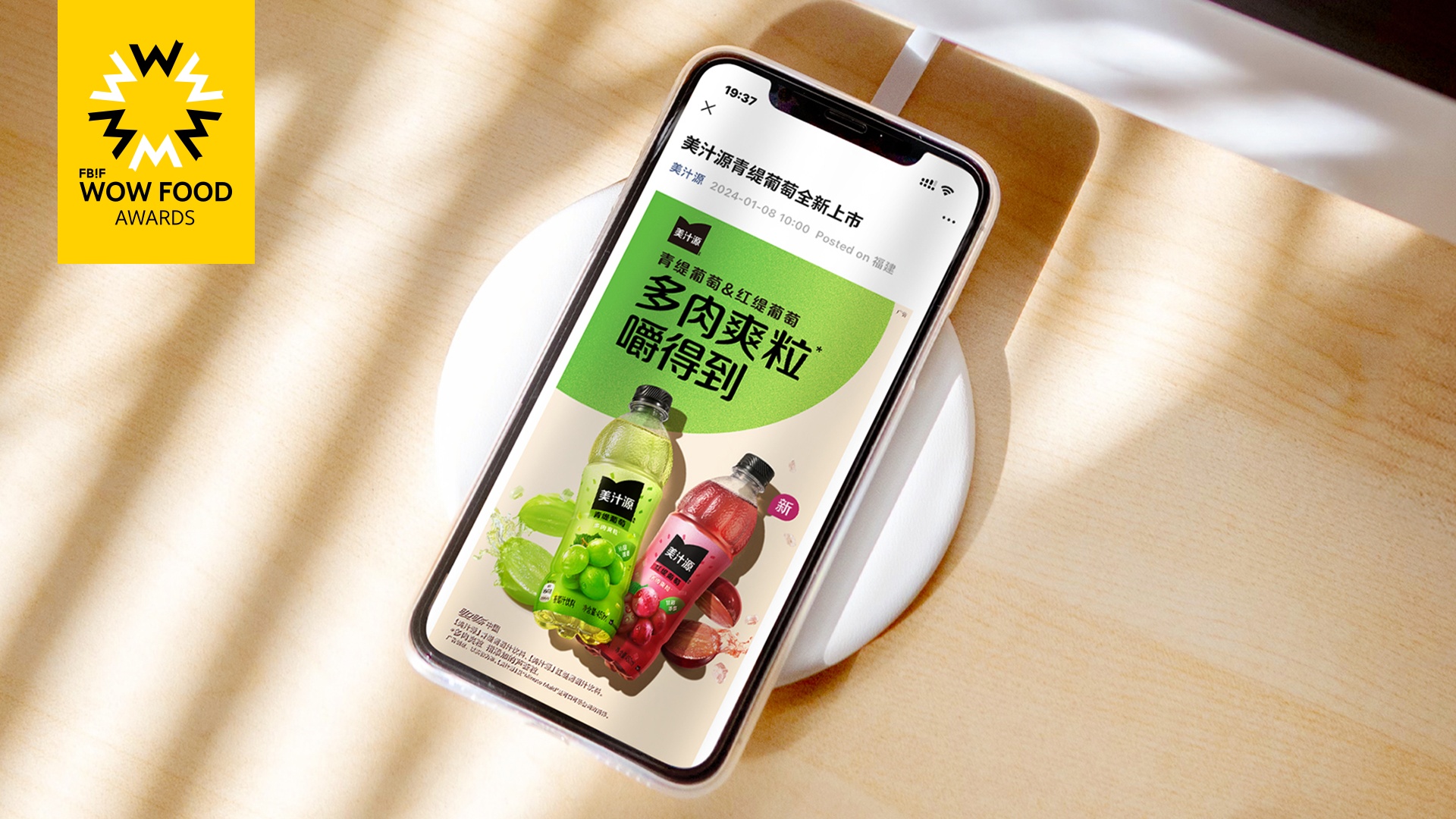
This label revamp is a key element of "Minute Maid" rebrand: attracting today's consumers with a simple and fresh appearance. In the age of information overload, "Minute Maid" gains a competitive edge through its minimalist design and messaging. While maintaining the brand's sense of quality, it also highlights a youthful and vibrant image.
Through the new label design, "Minute Maid" invites consumers to feel the sense of fresh vitality. This aligns perfectly with the brand's proposition “Filled with life”. The new design fully highlights the tastiness and multi-sensory experience of the products, perfectly reflecting "Minute Maid's" drive to create long-lasting brand appeal.
Highlights
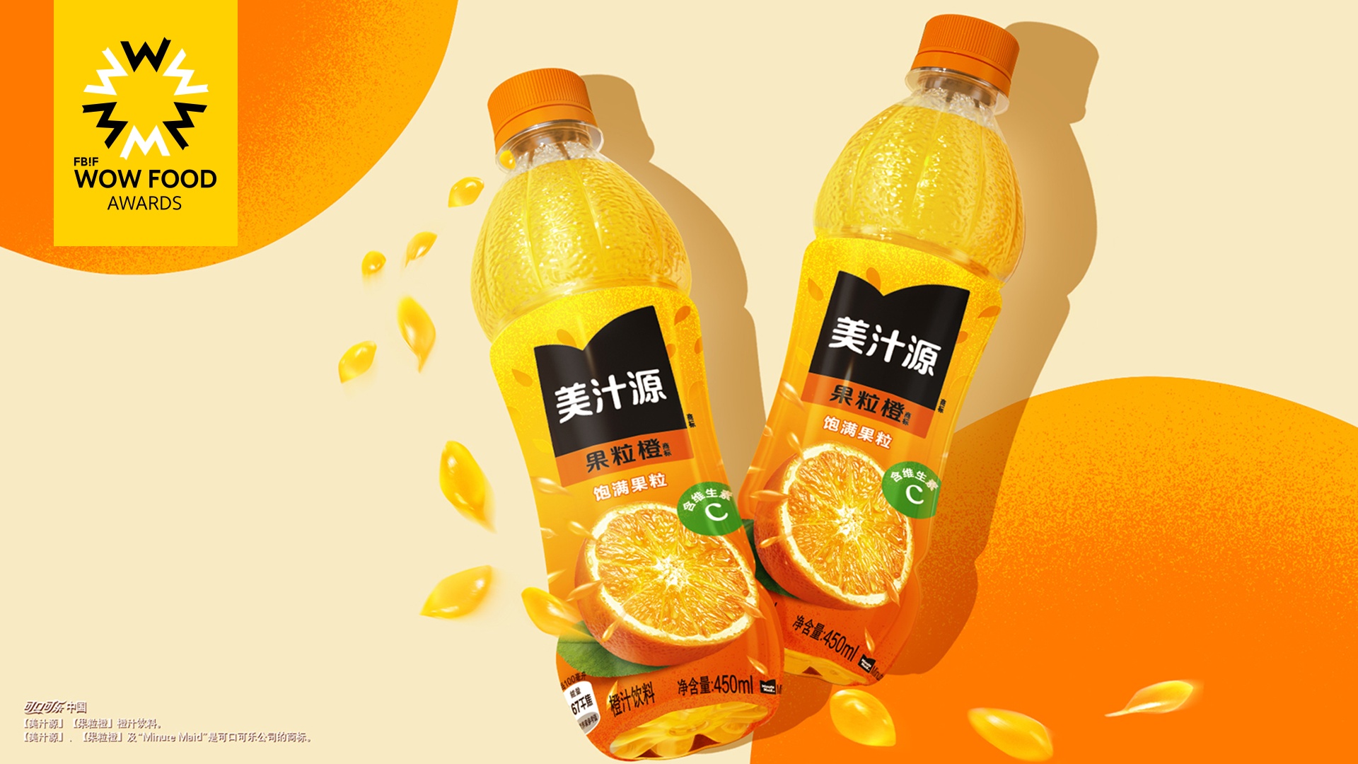
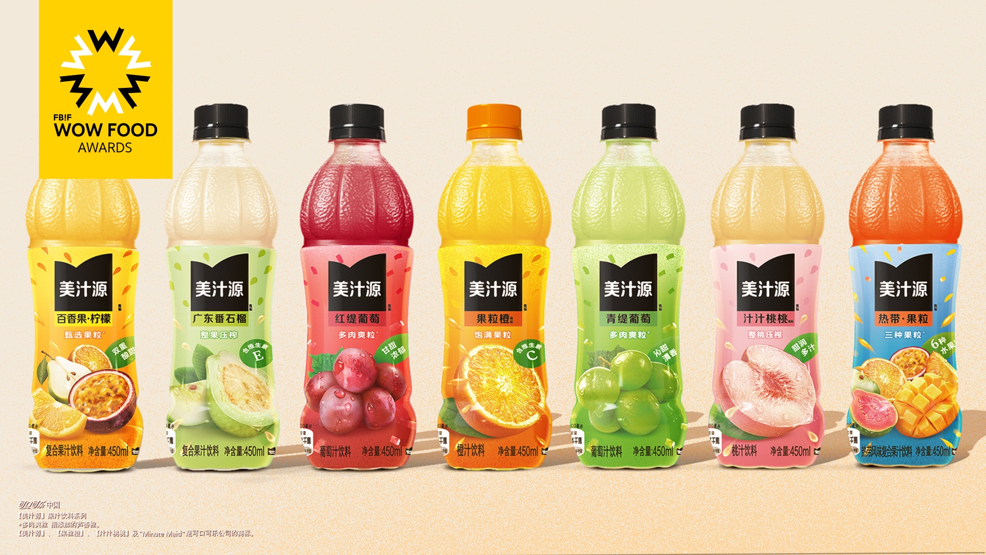
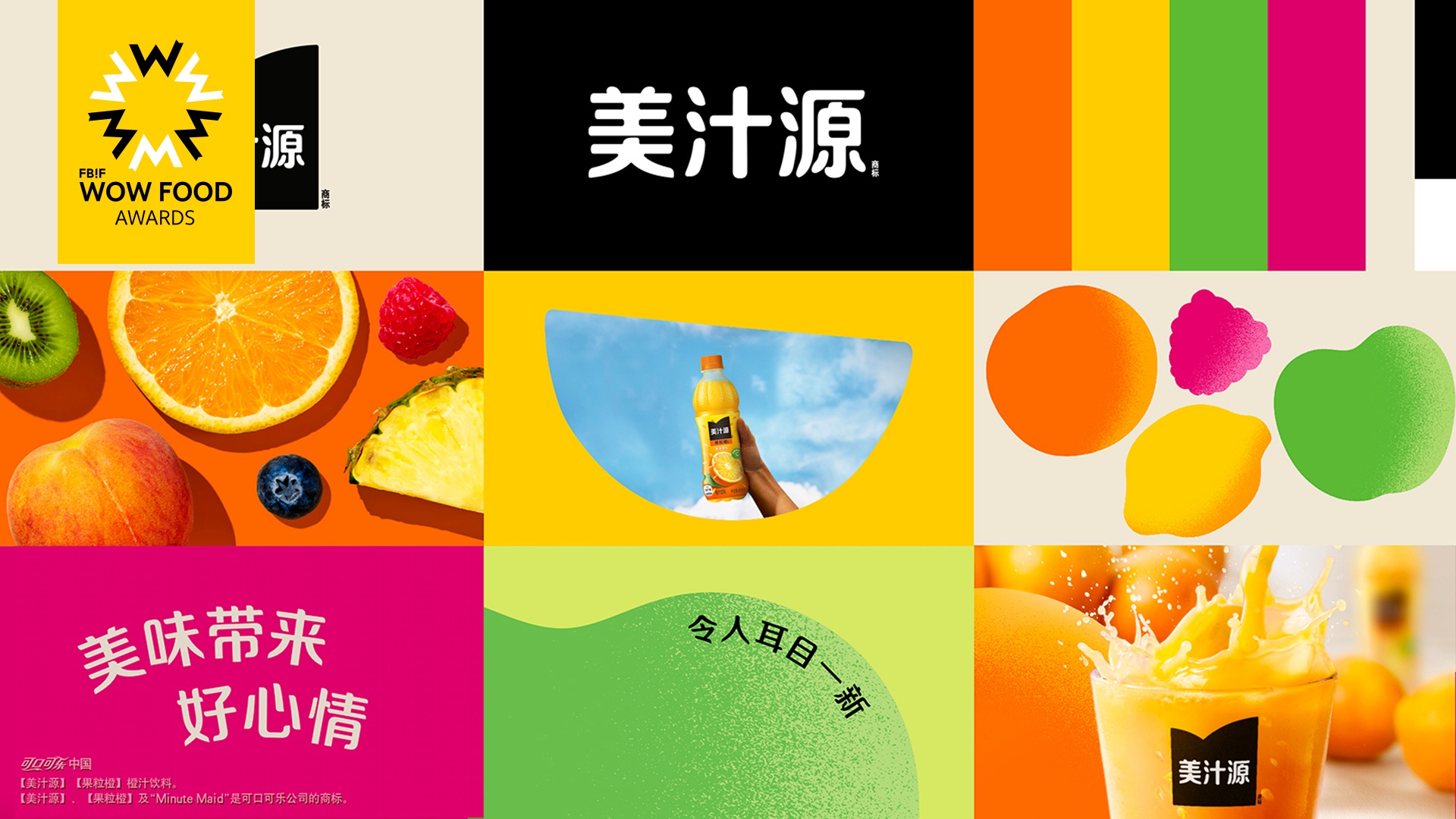
Through natural and real fruit imagery, “Minute Maid” bridges the gap with consumers, fully showcasing the multi-sensorial enjoyment that our products bring to the tastebuds through the vibrant, bursting bits of fruit. The fresh and bold colour schemes, along with the gradients, highlight the tastiness, freshness and naturalness of the products.
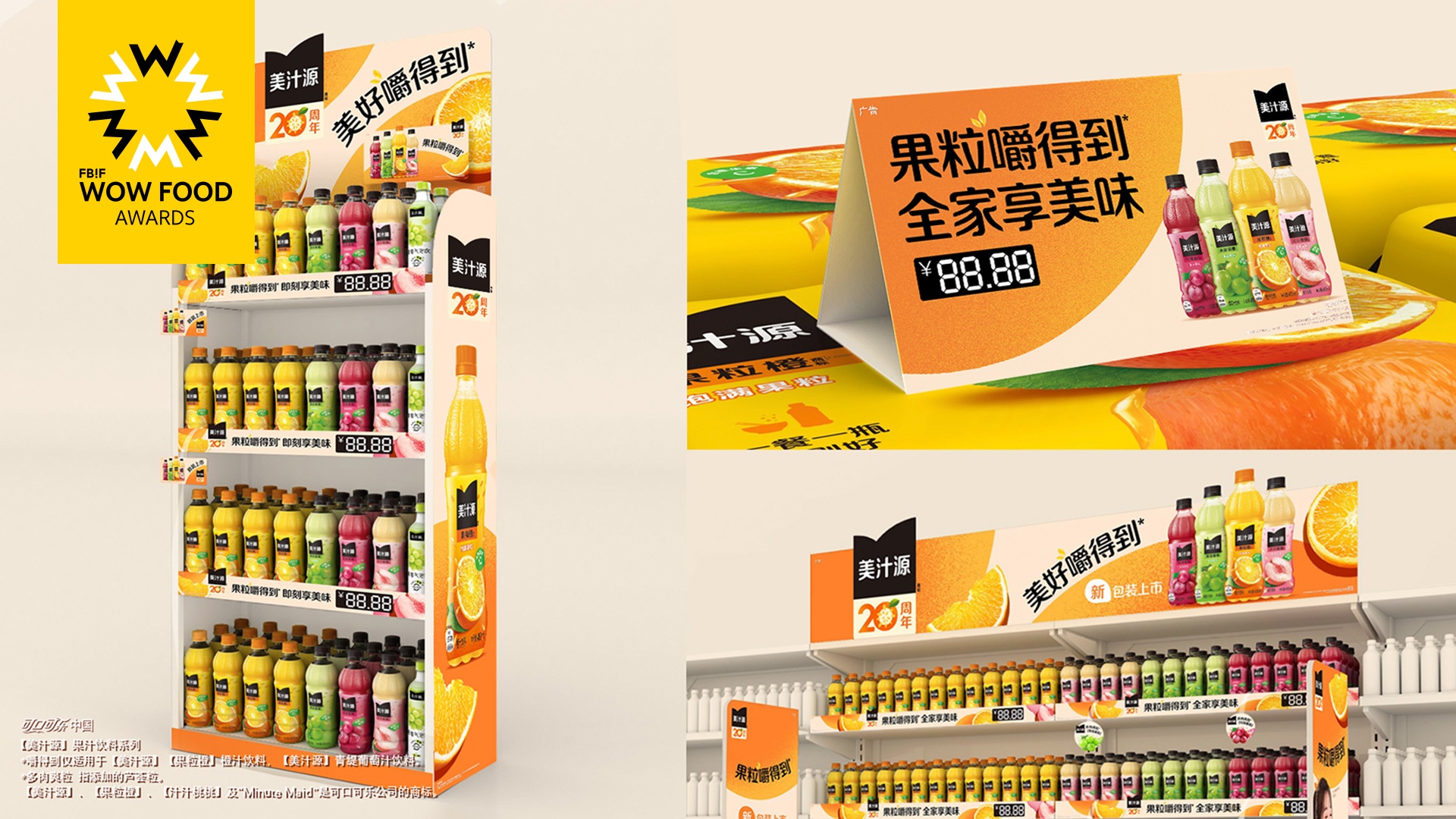
The design of the entire portfolio exudes a strong sense of cohesion, striking consumers with a vivid visual on-shelf impact, clearly conveying the overall brand tonality during the purchase experience.
The brand, flavour names, and various selling points are clearly reflected in the messaging hierarchy, ensuring that consumers can quickly recognise the information they need to streamline their decision-making in both online and offline environments.
Market Performance
无
Material(For concept works, please choose the material you plan to use)
PET塑料 PET material
Craft
“Minute Maid” continues to be committed to creating a sustainable eco-system. We're gradually adopting rPETG labels containing 30% post-consumer recycled plastics across the China Mainland market.
What functional designs of the work have enhanced the user experience?
“Minute Maid” owns a huge product portfolio of products in our current age of information overload. Keeping a simple, clear design and easy to read messaging helps communicate the core message concisely and helps consumers to more easily navigate our range.
Does the work consider sustainability (environmentally or commercially, or both)? If so, please explain.
“Minute Maid” is actively responding to China's "30-60" carbon peak and carbon neutrality goals by gradually adopting rPETG labels containing 30% post-consumer recycled plastics. Throughout “Minute Maid”’s 20 years in China, we’ve constantly improved the capabilities of our aseptic filling line, optimising the bottle design and nitrogen filling, which continuously reduces usage of virgin plastic from non-renewable sources, and helps to work toward our “World Without Waste” packaging vision.