
Type of applicant company
设计机构
Country
中国
Company Website
http://www.hezhipp.com/
Images

Brand of the Product
XIAOFUMAMA
Designer Name
UNI-WIS
Position of Designer
无
Target Consumer
Through data research in the sample market and online consumer research, it is determined that the target audience for the brand is women aged 30-40, accounting for as high as 94%, who share a common social role as "mothers" and belong to the high net worth refined mom group. Their daily purchasing needs include providing meals for themselves and their families, as well as buying healthy snacks for their children.
Distribution Channels
电商 E-commerce; 大型商场 Shopping Mall; 小型商超和便利店 Supermarket & CVS
Positioning
大货消费品 Mass Production
Design Story
The fresh corn industry is experiencing fierce competition and the market share of Small Mummy is being seized. The brand has weak brand power, and consumer awareness of the brand is very low. In this context, a brand upgrade for Small Mummy is necessary, involving the reevaluation of brand positioning and the reshaping of brand image.
During the project execution, through market visits and consumer research, it was determined that the core consumer group for the Small Mummy brand is women aged 30-40. Leveraging the founder's identity and original intention as a mother, the brand aims to establish a rapid trust link with the target consumers by appealing to the emotional consensus of the "mother" group, as well as societal consensus. The brand message of "Moms Pick the Best Quality" will be effectively conveyed.
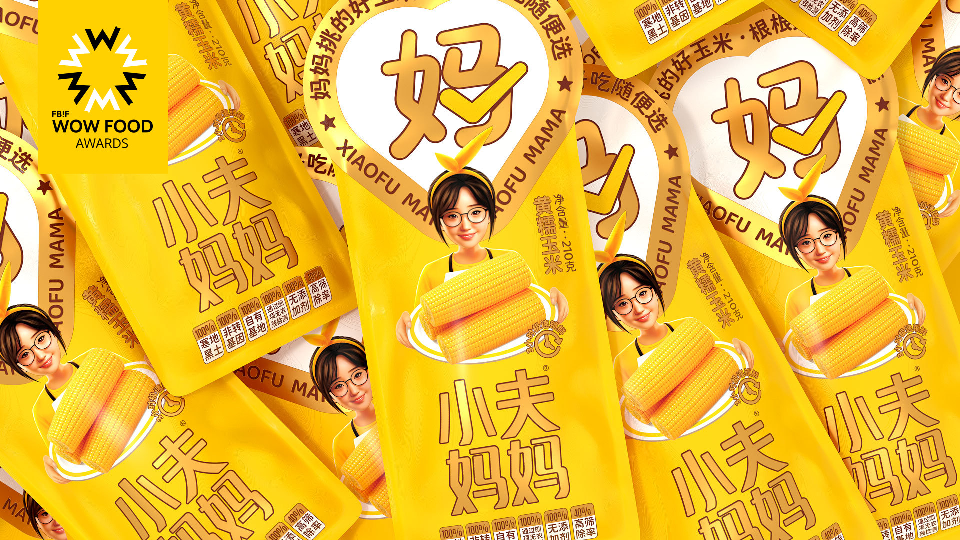
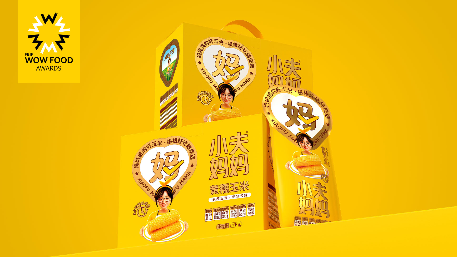
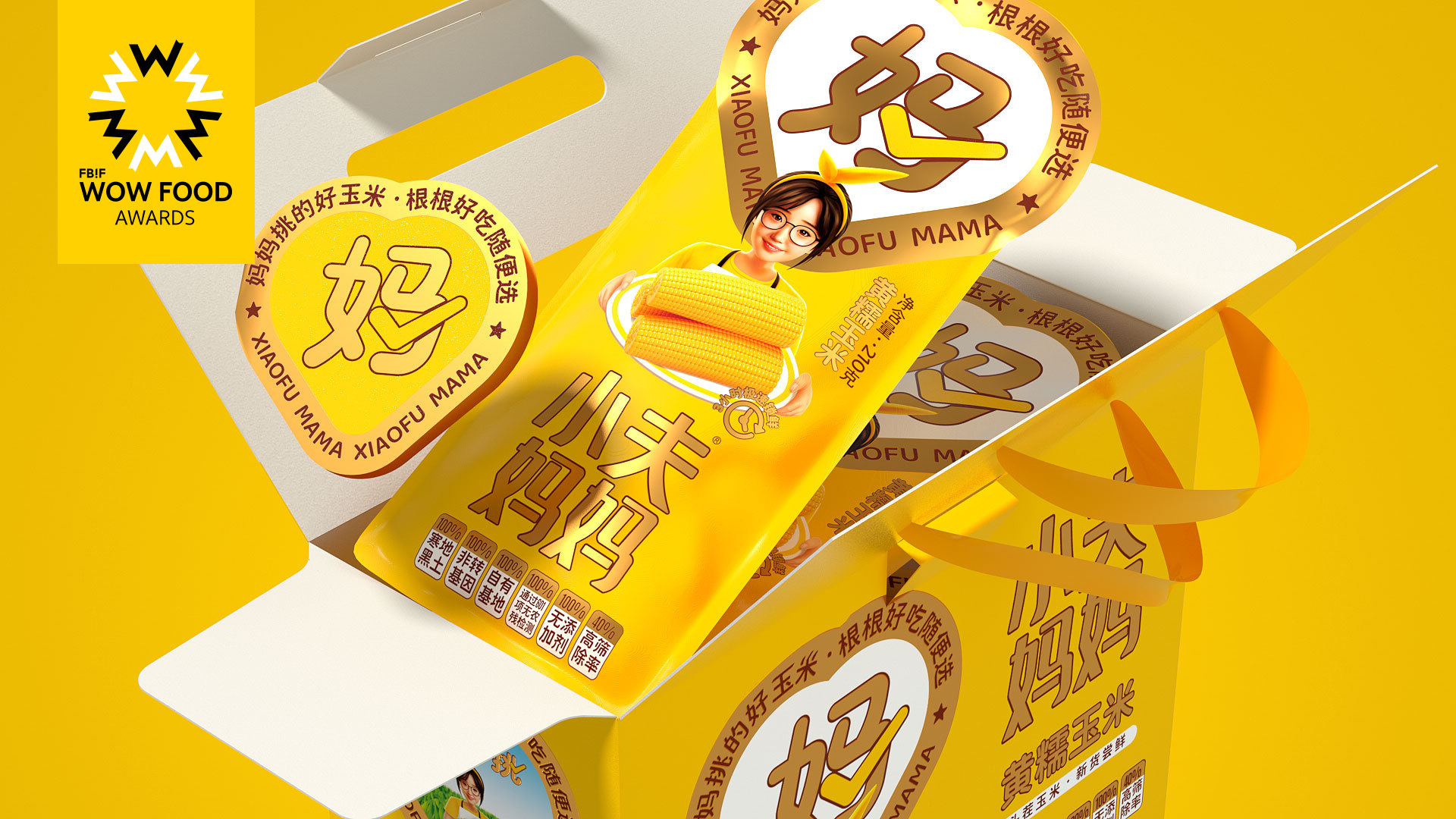
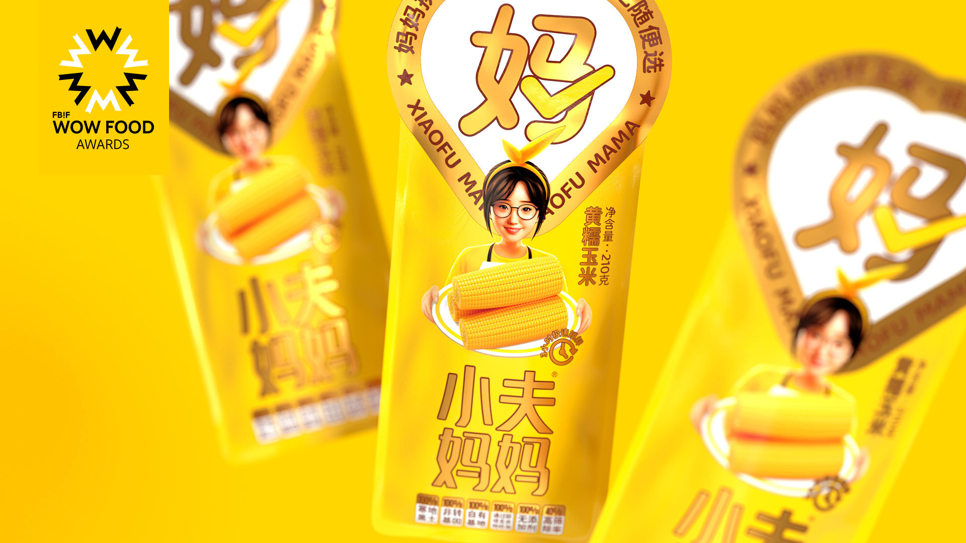
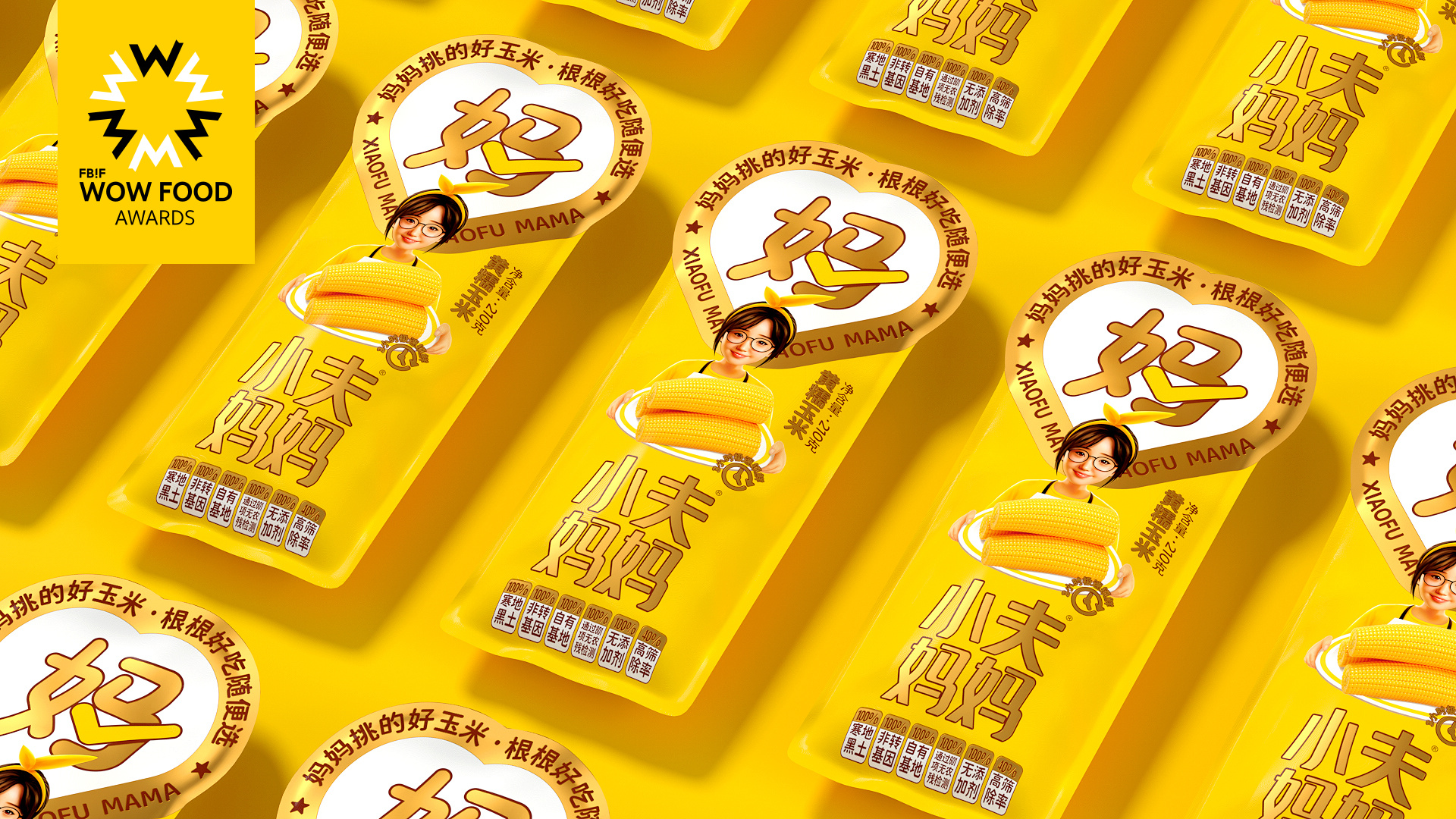
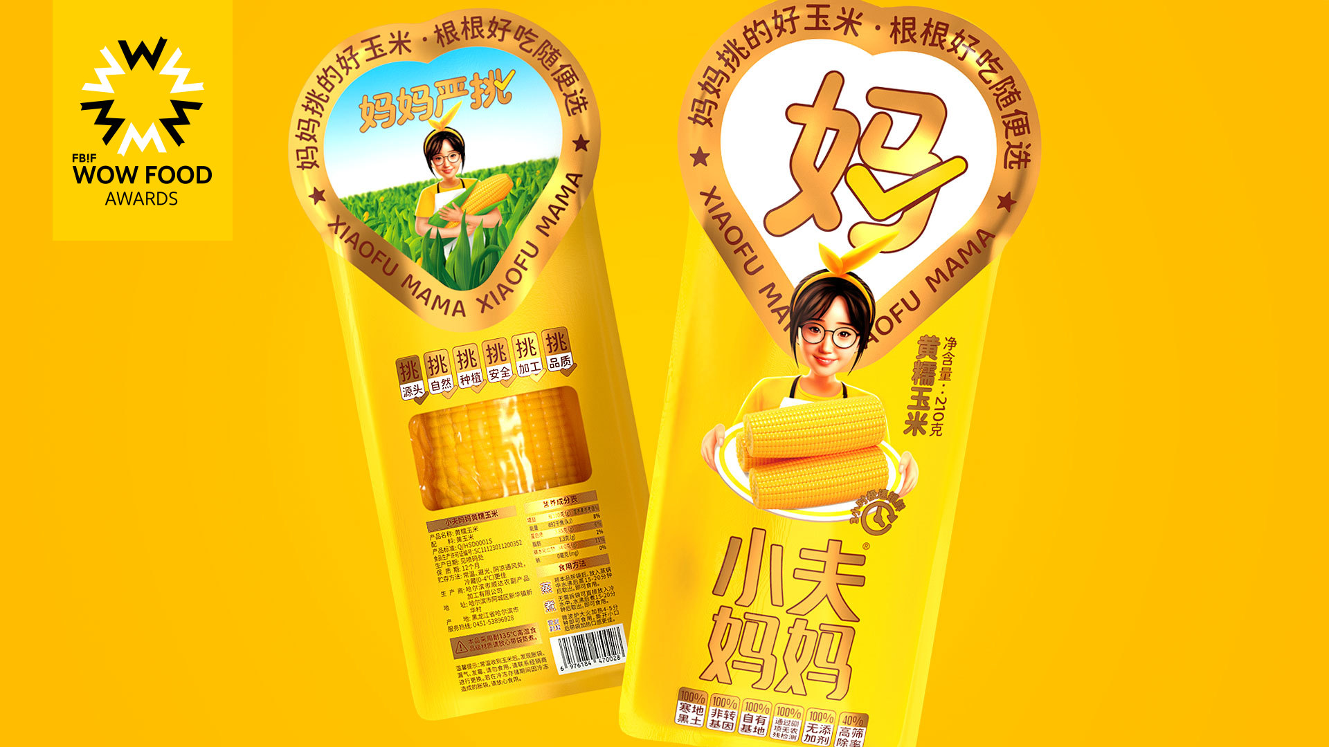
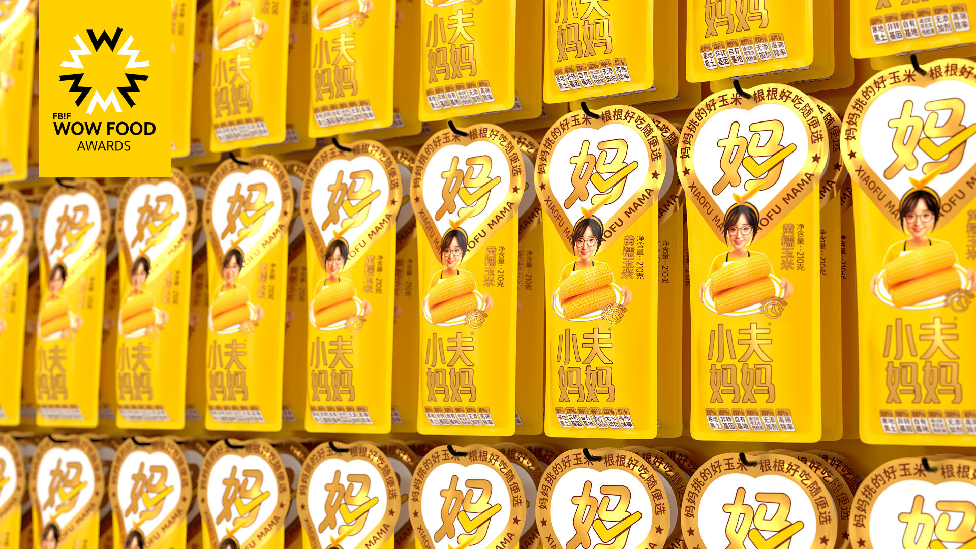
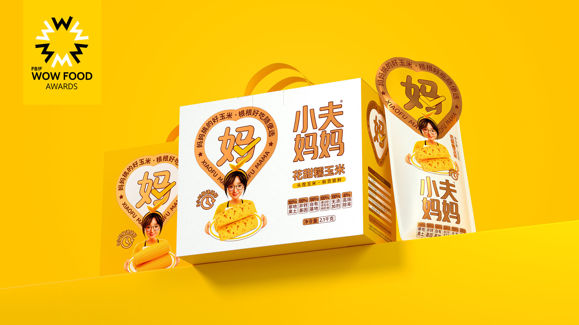
Packaging design will fully utilize shelf thinking, employing unique shapes and utilizing symbols such as a heart-shaped super symbol, as well as prominent "Mum" and "checkmark" elements to attract consumer attention and communicate the brand promise of "Corn selected by mothers, consistently delicious without the need for selection". The founder of Small Mummy will also be featured as the brand's IP character, providing an endorsement that enhances trust.
Highlights
The visual identity of the current competitive brands mostly follows a green crop style, lacking in uniqueness and appeal, and with core values that are severely homogeneous. To upgrade the brand image of Small Mummy, the packaging design for their product is equipped with a heart-shaped and unique design, emphasizing the existence of a super symbol and utilizing the low-cost memory of the "Mum" super-text as the core of the symbol, which is combined with the SLOGAN to achieve the desired effect. This design allows the product to stand out from its competitors, improving product recognition and memorability. In addition, the founder's image will be transformed into a real person with an IP character, establishing a brand story that tells of the brand's original intention to "share the corn I grow with more people who love simplicity and purity."
Market Performance
Since its launch, the product has received consistent praise and recognition from existing distributors. Sales data for the same quarter doubled, thanks to the clear concept of product positioning and the outstanding visual design. As a result, the brand has been able to expand its distribution channels at a much faster rate. There are now three million-level group leaders on online group-buying platforms, with two of them perfectly matched to the target consumer group of "mothers". The new channels have contributed to rapid growth in sales, and long-term cooperation agreements have been reached. Furthermore, the online flagship store on Taobao has experienced a growth rate of up to 300% during the same period.
Material(For concept works, please choose the material you plan to use)
PET塑料 PET material
Craft
The packaging adopts a unique die-cutting process, highlighting an enlarged brand symbol. The use of 8-color spot color printing technology is tailored to achieve a higher degree of color saturation, enabling a better reproduction of the brand's standard color and increasing the product's appetite appeal.
Does the design solve the problems that are common across the product category? If so, please explain.
1. We have addressed the pain points of lack of innovation in packaging forms, low packaging recognition rate, and inability to quickly create effective consumer memories in the corn agro-product industry. Through our brand design, featuring a unique heart-shaped super symbol and the super word "Mom," we have enhanced the recognition of our products on store shelves. The use of the "corn yellow" brand color creates a direct brand association memory.
2. We have successfully tackled the issue of severe homogeneity in corn product brand concepts. By leveraging the founder's story and brand heritage, we have extracted emotional value and linked the strictness of "Mom" with product quality. We have refined the "Five Major Selections" as our core selling points, increasing consumer trust and providing ample reasons for consumers to choose our brand.
What functional designs of the work have enhanced the user experience?
The product uses double-layer packaging, with the outer layer effectively blocking dirt and the inner layer utilizing imported HG film sealing, a material used for baby bottles which is non-toxic and resistant to temperatures as high as 135°C. This safeguards the high quality and great taste of the corn, while also allowing for easy cooking without the need to tear off the packaging. This ensures optimal taste for the corn while providing convenience to consumers who can directly steam or use a microwave oven for cooking. Ultimately, this packaging offers a more convenient and efficient consumer experience.
Did the design help increase the sales performance of the product? If so, please give related evidence.
Since its launch, the product has received consistent praise and recognition from existing distributors. Sales data for the same quarter doubled, thanks to the clear concept of product positioning and the outstanding visual design. As a result, the brand has been able to expand its distribution channels at a much faster rate. There are now three million-level group leaders on online group-buying platforms, with two of them perfectly matched to the target consumer group of "mothers". The new channels have contributed to rapid growth in sales, and long-term cooperation agreements have been reached. Furthermore, the online flagship store on Taobao has experienced a growth rate of up to 300% during the same period.
Does the work consider sustainability (environmentally or commercially, or both)? If so, please explain.
As a brand that targets the core audience of 30-40-year-old female mothers, we have a deep understanding of consumer psychology. Most women become very picky about ingredients after becoming mothers, especially when it comes to their children's food. Therefore, we have fully considered sustainable development in our brand's business strategy. In this brand upgrade, we have effectively conveyed the concept of "Mom's strict selection," establishing the "Mom" super word and the heart-shaped super symbol representing love. This helps to build strong trust and connections with our target user base, laying the groundwork for future expansion of our product lines. In the future, we may consider establishing a "Mom's Strict Selection" multi-brand collection platform to further expand our business.